Kinetic typography’s power isn’t in random motion; it’s in scientific precision that can dramatically increase message retention in a silent-first world.
- Effective text animation respects the viewer’s cognitive load by matching on-screen duration to average reading speeds.
- Brand recall is directly tied to a consistent « typographic schema »—using the same fonts consistently builds a memorable visual identity.
Recommendation: Stop treating on-screen text as an afterthought. Start designing it as a core strategic element to command attention and make your message stick.
You see the statistic everywhere: a vast majority of users watch social media videos with the sound off. As a social media manager, you’ve adapted by plastering text all over your content. The common advice is to just « add captions » or « make the text move. » But this often leads to a chaotic mess of flying words that viewers ignore or, worse, find irritating. Your message gets lost in the noise you created.
The problem is that most advice treats on-screen text as a simple utility. It fails to grasp the underlying principles of visual communication. The truth is, effective kinetic typography isn’t just about making text move; it’s a craft rooted in the science of perception, reading speed, and visual rhythm. It’s the difference between a video that gets scrolled past and one that stops a thumb in its tracks, compelling the viewer to absorb every word.
But what if the key wasn’t just *that* you use animated text, but *how* you use it? What if small, precise adjustments in timing, font choice, and placement could dramatically boost comprehension and brand recall? This is where a motion designer’s mindset changes the game. It’s about moving beyond basic captions and embracing typography as a powerful tool for storytelling and persuasion.
This guide will deconstruct the professional’s approach to kinetic typography. We will move past the generic tips and dive into the specific rules that govern legibility, focus, and brand impact in a fast-scrolling, silent-viewing environment. Prepare to transform your on-screen text from a necessary evil into your most powerful engagement asset.
To navigate this deep dive into the art and science of moving text, explore the key topics we’ll cover. Each section builds on the last, providing a complete framework for creating videos that resonate and retain.
Summary: Why Kinetic Typography Increases Social Media Retention by 40%?
- Why Your On-Screen Text is Too Fast for the Average Reader?
- How to Animate Keywords to Direct the Viewer’s Eye?
- Hard-Coded Text or Platform Captions: Which Drives Better Engagement?
- The Safe Zone Mistake That Hides Your Text Behind Interface Buttons
- How to Choose a Font That Remains Legible on Small Screens?
- Why Using Random Fonts in Video Reduces Brand Recall by 30%?
- When to Cut on the Beat and When to Cut on the Lyrics?
- Static vs Motion: Why an Animated Logo Adds £5k of Perceived Value?
Why Your On-Screen Text is Too Fast for the Average Reader?
The single biggest mistake in social media video is text that disappears before it can be read. This happens because creators pace text to their own narration speed, forgetting the viewer is reading, not listening. This mismatch creates a high cognitive load—the mental effort required to process information. When the load is too high, the brain simply gives up, and the viewer scrolls away. Your message is lost before it ever had a chance.
To solve this, you must respect the average reading speed. Most adults read at approximately 238 words per minute (WPM). However, a straight calculation isn’t enough. You need to add a buffer for comprehension and context switching. As a case study on platform-specific speeds shows, the ideal pace varies: educational YouTube content thrives around 140-160 WPM, while high-energy platforms like TikTok demand a faster 170-200 WPM pace to feel native. Ignoring these nuances means you’re either boring your TikTok audience or overwhelming your YouTube viewers.
The goal isn’t just to display words but to ensure they are absorbed. Pacing text correctly reduces cognitive friction, making your content feel effortless and satisfying to watch. It’s a fundamental sign of respect for the viewer’s attention. By slowing down and syncing to a realistic reading pace, you shift from simply showing information to effectively communicating it.
This isn’t a matter of guesswork; it’s a calculated decision that directly impacts retention. Getting the timing right is the first step toward professional-grade kinetic typography.
How to Animate Keywords to Direct the Viewer’s Eye?
Once your timing is right, the next level of mastery is directing attention. In a sea of on-screen text, not all words are created equal. Your goal is to use animation to create a visual hierarchy, turning key phrases into focal points that guide the viewer’s eye and reinforce your core message. Without deliberate emphasis, all text becomes flat background noise.
Think of your most important keyword as the lead actor on screen. It deserves a grand entrance. Techniques like scale-ups, color flashes, or a change in font weight can instantly signal importance. For instance, in a promotional video, the word « FREE » shouldn’t just appear—it should detonate on screen, drawing all focus. A powerful example is seen in Wyzowl’s work for a Shopify video featuring Tony Robbins. The theme word ‘hunger’ repeatedly bursts onto the screen with energetic motion, its impact amplified by the kinetic typography, making the concept unforgettable.
This is not about random movement. It’s about purposeful animation that serves the narrative. You can use subtle drifts to lead the eye from one point to another or a quick shake to emphasize a shocking statistic. The key is to be intentional. Each animation choice should have a « why » behind it, directly linked to the emotional or informational impact you want to create.
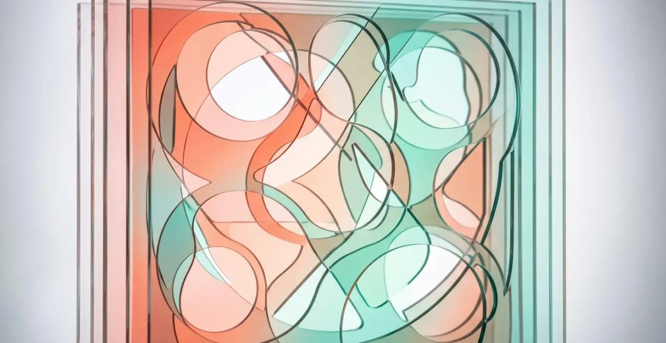
The visual layering shown above, though abstract, demonstrates a core principle: elements at different depths and with distinct visual properties naturally create focus. By applying this to text—making a keyword pop to the « front » with animation—you create a clear path for the viewer’s attention, ensuring your main point is not just seen, but felt.
By animating with purpose, you transform passive viewers into active participants, guiding them through your message one impactful keyword at a time.
Hard-Coded Text or Platform Captions: Which Drives Better Engagement?
The context for this entire discussion is the mobile-first nature of video consumption. With data showing that 78% of worldwide video viewing happens on mobile devices, every decision must be optimized for the small screen. This brings up a crucial technical choice: should you « burn » your beautifully designed kinetic typography into the video file (hard-coding) or rely on the platform’s native captioning system (like YouTube or Instagram captions)?
The answer is a strategic trade-off between brand control and discoverability. Hard-coded kinetic typography gives you absolute creative freedom. You control the font, color, animation, and placement, ensuring a perfectly branded and visually impactful experience. This is essential for reinforcing brand identity and creating the high-end feel discussed earlier. However, this text is invisible to platform algorithms, offering zero SEO benefits.
On the other hand, platform-native captions are fully indexable by search engines, which can significantly boost your video’s organic reach and discoverability. They also have a major accessibility advantage, as users can customize the size, font, and contrast to their needs. The massive downside is the complete loss of brand control. Your text is rendered in a generic, default style that does little to enhance brand recall or visual engagement.
The optimal strategy is often a hybrid approach: use hard-coded kinetic typography for key headlines, titles, and impactful keywords to maintain brand control and visual flair. Then, provide a full transcript via the platform’s native caption system for accessibility and SEO. This gives you the best of both worlds—visual punch and algorithmic reach.
The following table breaks down the core trade-offs to help you decide which approach, or combination, is right for your specific goals.
| Aspect | Hard-Coded Kinetic Typography | Platform Native Captions |
|---|---|---|
| SEO/Discoverability | Invisible to algorithms | Fully indexable, boosts organic reach |
| Brand Control | Complete control over style and animation | Limited to platform defaults |
| Accessibility | Fixed size/contrast | User can adjust size/appearance |
| Engagement Rate | Higher brand recall and visual impact | Standard engagement |
| Production Time | Requires more design work | Quick to implement |
Ultimately, the choice depends on whether your primary goal for a specific video is maximum brand impact or maximum organic reach.
The Safe Zone Mistake That Hides Your Text Behind Interface Buttons
You’ve crafted perfectly timed, beautifully animated text. But when you upload it, the most important words are hidden behind the platform’s « Like » button, the user’s profile picture, or the progress bar. This is the safe zone mistake, and it instantly negates all your hard work. Every social platform overlays its user interface (UI) on top of your video, and these zones are a minefield for text placement.
The « safe zone » isn’t just one box in the middle of the screen. It’s a complex and constantly changing map that differs by platform, device, and even user status (logged-in vs. logged-out views can have different UI). For vertical video on platforms like TikTok and Instagram Reels, the bottom quarter of the screen is a « no-go » zone, cluttered with captions, buttons, and descriptions. The right-hand side is equally dangerous, housing the engagement icons.
The only truly safe area is the vertical-center third of the screen. Placing your most critical information here ensures it remains visible even when a user is scrubbing through the video. To be extra cautious, professional motion designers work within a « focus zone » that’s even tighter than the technical safe zones, creating a 20% internal margin to avoid having text near the edges where peripheral vision drops off.

Testing is non-negotiable. Before publishing, you must preview your video on multiple devices—an iPhone with its Dynamic Island, a standard Android phone, and a tablet. Check it in both vertical and horizontal orientations if applicable. This small step prevents the embarrassing and engagement-killing mistake of having your call to action obscured by a « Follow » button.
Here are some practical steps to ensure your text is always visible:
- Test your video on at least 3 different device types (iPhone with Dynamic Island, standard Android, tablet).
- Check both logged-in and logged-out views as UI elements differ.
- Place critical text in the vertical-center third of the screen for scrubbing safety.
- Create a ‘focus zone’ that’s 20% tighter than the technical safe zone to avoid peripheral vision blind spots.
- Document UI changes after each platform update and adjust your templates accordingly.
Designing for the safe zone isn’t a limitation; it’s a professional discipline that ensures your message is delivered, no matter the device.
How to Choose a Font That Remains Legible on Small Screens?
Your font choice is the bedrock of legible on-screen text. A font that looks beautiful on a large desktop monitor can become an unreadable smudge on a mobile screen. The key challenge on social media is designing for glanceable reading—where viewers are consuming content quickly and in distracting environments. Your typography has milliseconds to be recognized and understood.
Research from MIT’s Agelab on glanceable reading is clear: for quick comprehension, bigger is better in every way. Larger font sizes, regular widths (not condensed), and even uppercase text consistently outperform their smaller, narrower counterparts. One of the most critical but often overlooked factors for mobile legibility is a font’s x-height. This is the height of a lowercase « x » relative to the height of a capital letter. Fonts with a high x-height, like Helvetica or Inter, have open, clear letterforms that remain legible even at small sizes. This isn’t just a design theory; research shows that using a font with a generous x-height improves mobile reading speed by 32%. This is a massive performance gain achieved just by choosing the right font.
Conversely, fonts with low x-heights or very thin strokes (like Garamond or Didot) can disintegrate on low-resolution screens or under video compression. You should also prioritize fonts designed specifically for user interfaces (UI), such as Inter, SF Pro, or Roboto. These typefaces were engineered from the ground up for screen clarity, unlike many classic fonts that were born in the age of print.
Finally, always test for contrast. The Web Content Accessibility Guidelines (WCAG) recommend a minimum contrast ratio of 4.5:1 between text and background. This ensures your text is readable for everyone, including those with visual impairments. Choosing a legible, high-contrast font is not just good design; it’s a fundamental part of creating inclusive and effective content.
Don’t let a poor font choice sabotage your entire video. Prioritize clarity, high x-height, and strong contrast to ensure your message is always received loud and clear.
Why Using Random Fonts in Video Reduces Brand Recall by 30%?
In the quest for visual variety, many brands fall into the trap of using different, « interesting » fonts in every new video. This is a critical strategic error. According to cognitive science, viewers subconsciously build a « typographic schema » for a brand—a mental model of its visual identity. When you use a random font, you violate this schema, causing cognitive dissonance that weakens brand association and trust.
As one typography research paper notes:
Viewers subconsciously build a ‘schema’ (a mental model) for a brand’s visual identity. Using random fonts violates this schema, causing cognitive dissonance.
– Typography Research, Based on cognitive science principles
Think of your font as your brand’s tone of voice in written form. A luxury brand using a playful, comic-book font feels jarring and inauthentic. A tech startup using an old-world serif font feels out of touch. Consistency is what builds recognition and reinforces your brand’s personality. When a viewer sees your specific font, they should instantly think of your brand, even before your logo appears.
The cost of this inconsistency is tangible. Studies have shown that font and design inconsistencies can be a major drain on marketing effectiveness. If, as some marketing analyses suggest, 30% of brand recall is lost due to font inconsistency, then you are effectively wasting a significant portion of your advertising budget. The solution is to establish a strict typographic system: one primary font for headlines and one secondary font for body text. That’s it. These fonts should be used consistently across all video content, from social media clips to corporate presentations.
Your Action Plan: Auditing Your Typographic Signal
- Points of contact: List all channels where the typographic signal is emitted (Reels, Stories, YouTube ads, organic posts).
- Collect: Inventory the existing elements (fonts, animation styles, color palettes used in the last 10 videos).
- Coherence: Confront these elements with brand values/positioning. Does the « fast, glitchy » text match a « calm, trusted » brand?
- Mémorability/émotion: Score each asset on a grid: is the typography unique and memorable or generic and forgettable? Does it evoke the right emotion?
- Plan d’intégration: Prioritize replacing inconsistent assets and templatize the correct typographic system to fill the gaps.
Stop thinking of fonts as decoration and start treating them as a core brand asset. Consistency isn’t boring; it’s how you build an unforgettable brand.
When to Cut on the Beat and When to Cut on the Lyrics?
The most sophisticated kinetic typography feels fused with its soundtrack. This is achieved through precise synchronization, but it’s not as simple as making every word pop to the beat. The professional’s secret lies in understanding the different roles of rhythm and lyrics and knowing when to sync to each. This is the essence of creating visual rhythm.
Syncing text animations to the beat (especially the kick drum or snare) is your tool for building energy and emotional impact. It creates a visceral, head-nodding feeling that draws the viewer in. This is perfect for intros, montages, or high-energy moments where the feeling matters more than the specific information. However, overusing this technique can lead to « edit fatigue, » where the constant pulsing becomes visually exhausting.
Syncing text to the lyrics or spoken words is your tool for information delivery. By having a word appear precisely as it’s sung or spoken, you reinforce the message and aid comprehension. A pro tip is to use cognitive priming: animate the text to appear on screen about 0.2 seconds *before* the corresponding lyric is heard. This tiny head start gives the brain time to process the word visually, so when the audio hits, the connection is instant and powerful. This technique dramatically increases message retention.
The art is in the balance. A great piece of kinetic typography, like the iconic work of Saul Bass or modern tributes to his style, mixes these techniques. It might use beat-syncing to build a crescendo and then switch to lyric-syncing for the key tagline, creating a dynamic and engaging experience. As a rule of thumb, limit your hard-synced animations to 60-70% of the beats and lyrics. Strategic pauses and moments of stillness are just as important as movement; they provide visual rests and make the animated moments feel more impactful.
By mastering this rhythmic interplay, you move beyond simple animation and start conducting a visual symphony that is impossible to ignore.
Key Takeaways
- Text speed is a science: Respect average reading speeds (around 238 WPM) and add a buffer for cognitive load. Pacing varies by platform.
- Consistency builds memory: A strict, consistent font system is non-negotiable for building a strong « typographic schema » and boosting brand recall.
- Rhythm is everything: Synchronize text with audio cues—beats for energy, lyrics for information—to maximize impact and create an engaging visual rhythm.
Static vs Motion: Why an Animated Logo Adds £5k of Perceived Value?
The principles of kinetic typography don’t just apply to captions and headlines; they extend to your most valuable brand asset: your logo. In a video context, a static logo that simply fades in and out feels flat and dated. An animated logo, however, communicates dynamism, quality, and attention to detail, significantly increasing the perceived value of your brand and content.
Motion gives your logo a personality. A logo that assembles itself piece by piece can communicate innovation and construction. A logo that smoothly morphs from one shape to another can suggest flexibility and transformation. This small piece of animation at the beginning or end of your video (a « logo sting ») acts as a powerful signifier of quality. It tells the viewer that this isn’t just another low-effort social clip; it’s a piece of professionally produced content from a brand that cares about its image.
This increase in perceived quality is not just a vague feeling; it translates into measurable metrics. As the data below shows, animated logos consistently outperform their static counterparts across key performance indicators. They don’t just look better—they perform better, leading to higher brand recall, increased click-through rates, and longer engagement times. The perception of premium quality can directly influence a customer’s willingness to pay more for a product or service, effectively adding tangible value to your brand.
This table compares the impact of a static logo versus an animated logo in a video context, highlighting the clear advantages of investing in motion.
| Metric | Static Logo | Animated Logo | Improvement |
|---|---|---|---|
| Brand Recall | 45% | 68% | +51% |
| Perceived Premium Quality | Baseline | +35% | +35% |
| Video CTR | 2.3% | 3.1% | +35% |
| Production Value Perception | Standard | Premium | 2x higher rating |
| Viewer Engagement Time | 8 seconds | 12 seconds | +50% |
Stop letting your message get lost in the scroll. Start applying these typographic principles—from pacing and placement to font consistency and logo animation—to transform your videos from silent-viewed content into unforgettable brand experiences.