An animated logo isn’t just a visual upgrade; it’s a strategic investment that adds tangible, quantifiable value to a brand by transforming a static mark into a high-performance communication asset.
- It leverages cognitive science to significantly boost brand recall and emotional connection.
- It establishes ownable « Motion DNA, » a unique brand characteristic that can function as defensible intellectual property.
Recommendation: Reframe the conversation with clients. Shift the focus from the cost of an animation to the ROI of building a more valuable and memorable brand asset.
As agency owners, we’ve all faced the question from a client: « It’s just our logo, but moving. Why does it cost so much? » For years, the justification has leaned on soft benefits like « it’s more engaging » or « it grabs attention. » While true, these arguments fail to capture the real, hard value that professional motion design brings to the table. They position motion as a decorative expense rather than what it truly is: a strategic investment in brand equity.
The conversation needs to change. The value of an animated logo isn’t just in the spectacle; it’s rooted in cognitive science, strategic positioning, and technical execution. It’s about building an asset that performs, communicates, and adds measurable perceived value far exceeding its production cost. The difference between a generic template animation and a custom-crafted motion identity is the difference between a disposable flyer and a cornerstone of your client’s intellectual property.
This article breaks down the specific mechanisms that turn motion into value. We will explore the neuroscience of why moving shapes are more memorable, dissect the technical preparation that separates amateur from professional work, and provide a strategic framework for choosing the right animation style. It’s time to arm yourself with the arguments to confidently justify the investment and demonstrate that an animated logo isn’t a cost—it’s an asset that builds the brand’s bottom line.
In this comprehensive analysis, we will deconstruct every facet of animated logo value, from the initial psychological impact on the consumer to the final delivery of a robust, versatile brand asset. The following sections provide a complete roadmap for understanding and articulating this value to your clients.
Summary: Unpacking the Value of Motion in Branding
- Why Movement Helps Brains Remember Abstract Shapes?
- How to Prepare Illustrator Files for After Effects Animation?
- Flat 2D or Extruded 3D: Which Logo Style Fits a Tech Startup?
- The Animation Mistake That Makes Your Logo Hard to Read
- How to Export Animated Logos for Overlay on Any Video Footage?
- Canva Templates or Custom After Effects: Which Builds Stronger Recognition?
- Vintage Glass or Sharp Modern Lenses: Which Convey « Authenticity »?
- Why Kinetic Typography Increases Social Media Retention by 40%?
Why Movement Helps Brains Remember Abstract Shapes?
The primary value of an animated logo begins with a fundamental principle of human neurology: our brains are hardwired to notice and prioritize motion. A static object can be ignored, but a moving one instinctively captures our attention. This isn’t just about being « eye-catching »; it’s a cognitive shortcut to memory. When a logo moves, it engages more of the brain’s processing power, transitioning from a simple visual recognition task to a more complex and engaging experience.
This heightened engagement has a direct impact on brand recall. A neuroscientific analysis of logo design’s impact confirms that animated logos generate significantly higher emotional engagement and positivity compared to their static counterparts. The study found that while dynamic logos increase cognitive demand, this « work » results in a stronger, more positive emotional imprint. In essence, the brain invests more effort in processing the movement, and this investment pays dividends in memory retention. Viewers don’t just see the logo; they experience it, making the brand itself more memorable.
This creates what is known as cognitive fluency. The easier it is for a brain to process and recall information, the more trustworthy and positive that information feels. A simple, well-designed motion path creates a memorable « schema » for the logo. When the consumer sees the static version later, their brain can subconsciously replay the motion, reinforcing the brand mark with each exposure. This is the scientific basis for why an animated logo isn’t just a gimmick—it’s a tool for building a deeper, more resilient mental connection with an audience.
How to Prepare Illustrator Files for After Effects Animation?
The magic of a fluid, professional logo animation doesn’t start in After Effects; it begins with meticulous preparation in Adobe Illustrator. This foundational step is a critical differentiator between a cheap, clunky animation and a high-value motion asset, and it’s a key part of justifying the cost to a client. A poorly prepared file leads to hours of frustrating technical fixes, while a clean file enables creative freedom and efficiency. The principle is simple: structure dictates potential.
A professional workflow requires deconstructing the static logo into a logical system of layers, ready for motion. This isn’t just about separating elements; it’s about thinking like an animator before the first keyframe is set. Each component that will move independently must be isolated on its own layer and given a descriptive name. This systematic organization is the blueprint for the animation’s story.
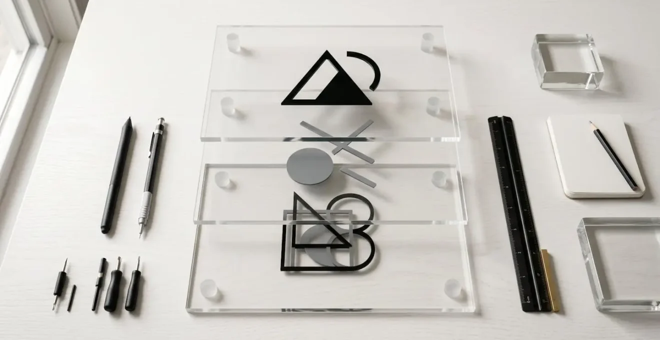
As the visual demonstrates, separating components onto distinct layers is fundamental. However, professional preparation goes deeper. Here are the core steps that ensure a seamless transition from a static design to a dynamic asset:
- Separate and Name: Each individual logo element must be on its own layer with a clear naming convention, such as ‘wordmark_text’ or ‘icon_swoosh’.
- Group for Narrative: Layers should be grouped based on how they will animate together, often following a simple story structure like setup, action, and resolution.
- Simplify Paths: To ensure smooth performance, especially for web-based formats like Lottie, all vector paths must be simplified, reducing unnecessary anchor points that can bloat file sizes.
- Use Compound Paths: Where possible, use compound paths instead of clipping masks. They are far more efficient for animation software to process and result in cleaner, more reliable motion.
This level of structured preparation is non-negotiable for creating a professional-grade animation. It represents the « hidden » work that enables the smooth, compelling motion clients expect, and it’s a crucial part of the value an expert agency provides.
Flat 2D or Extruded 3D: Which Logo Style Fits a Tech Startup?
Once the technical foundation is set, the next strategic decision is choosing the animation style. This isn’t merely an aesthetic choice between « flat » and « three-dimensional »; it’s a crucial branding decision that communicates a specific message about the company. For a tech startup, the choice between a clean 2D animation and a substantial 3D extrusion can mean the difference between being perceived as a nimble app or a heavyweight enterprise player.
A flat 2D style often communicates clarity, speed, and a seamless user experience. It feels modern, approachable, and integrates perfectly with digital interfaces. This makes it an ideal choice for SaaS companies, mobile apps, and consumer-facing platforms where user-friendliness and speed are paramount. The motion is typically clean, crisp, and focuses on elegant transitions rather than complex textures or lighting.
Conversely, extruded 3D logos inherently signal substance, complexity, and investment. The addition of depth, lighting, and material textures creates a sense of tangibility and permanence. This style is highly effective for « deep tech, » hardware, or enterprise B2B companies that need to project an image of R&D depth, security, and market-leading professionalism. While a 2D logo says « we’re fast and easy, » a 3D logo says « we’re powerful and built to last. » The subtle lighting and material choices can subconsciously build associations with credibility and premium quality.
Choosing the right style requires a deep understanding of the client’s business sector, target audience, and core brand message. The following table breaks down these strategic considerations for different tech sectors, providing a clear framework for your recommendation.
| Tech Sector | Recommended Style | Perception Created | Best Use Case |
|---|---|---|---|
| SaaS/Apps | Flat 2D | Clarity, speed, seamless UI/UX | Mass-market user acquisition |
| Deep Tech/Hardware | Extruded 3D | Substance, complexity, R&D depth | Investor presentations, B2B |
| FinTech/B2B Platforms | 2.5D Stack | Sophistication without heaviness | Building trust and innovation |
Ultimately, the decision is not about which style is « better, » but which style best serves the brand’s strategic goals. Guiding a client through this choice demonstrates your value not just as an animator, but as a brand strategist.
The Animation Mistake That Makes Your Logo Hard to Read
Not all motion is good motion. A poorly executed animation can do more harm than a simple static logo by creating confusion, frustration, or even making the brand mark illegible. The single biggest mistake is sacrificing legibility for spectacle. An animation that is too fast, too complex, or too flashy defeats its own purpose if the viewer cannot clearly read and register the final brand name and mark. This is where professional expertise becomes a form of brand insurance.
An effective logo animation follows a clear narrative arc: it begins with an engaging movement and, most importantly, resolves into a clean, static « lockup. » This final hold is non-negotiable. Without a moment of stillness, the brain has no time to process and store the brand identity. Motion blur, while a useful tool, can quickly become an enemy. Excessive or poorly controlled blur can create a « smear effect, » turning crisp vectors into unreadable smudges and devaluing the brand’s sharp identity.
Furthermore, timing is everything. An animation that drags on for ten seconds will annoy viewers and hurt completion rates on video ads. As the Clipchamp Editorial Team notes, the sweet spot is concise and impactful. A great logo animation delivers its message and gets out of the way, respecting the viewer’s time while leaving a memorable impression. To ensure your animations are adding value, not detracting from it, use the following audit.
Your Logo Animation Audit: 5 Critical Checks
- Legibility Check: Does the animation resolve into a crystal-clear, readable brand mark, or is it obscured by excessive motion or effects?
- Final Lockup Hold: Does the final logo remain completely motionless for a minimum of 0.5-1 second to allow for cognitive registration?
- Motion Blur Integrity: Is motion blur used to enhance movement, or does it create a « smear effect » that degrades the sharpness of the logo?
- Timing Efficiency: Is the total animation duration between 2-5 seconds, long enough to make an impact but short enough to avoid viewer fatigue?
- Accessibility Review: Does the animation avoid rapid strobing, flashing, or jarring movements that could be harmful or uncomfortable for viewers?
Avoiding these common pitfalls is what separates a professional motion designer from a hobbyist with a template. It’s this disciplined approach that ensures the final asset strengthens the brand, rather than weakening it.
How to Export Animated Logos for Overlay on Any Video Footage?
Creating a beautiful animation is only half the battle. Delivering it as a versatile, future-proof asset is what provides long-term value to a client. A single MP4 file is not a brand package; it’s a limitation. To be truly useful, an animated logo must be provided in multiple formats, each designed for a specific use case, especially for overlaying on video footage. This requires exporting with an alpha channel, which preserves transparency.
The alpha channel is what allows the animated logo to be placed over any background—be it a video, a colored slide, or a website header—without a clumsy white or black box around it. Formats like ProRes 4444 and MOV with an alpha channel are the gold standard for video editing, offering lossless quality for professional post-production. For the web, formats like WebM and Lottie (JSON) provide the same transparency but with significantly smaller file sizes, crucial for website performance.
A professional agency anticipates these needs and delivers a comprehensive package. This includes not just the full-color version but also monochrome variants (all-white and all-black) to ensure the logo is legible on any background, light or dark. This foresight prevents endless back-and-forth with the client when they discover their « one file » doesn’t work on their new presentation deck.
Case Study: The Master Motion Brand Package
Top-tier motion designers go beyond a single animation. They deliver a « Master Motion Brand Package » that functions as a piece of company IP. This includes creating and documenting the definitive ‘master’ version of the motion, which can then be used to create variants. Crucially, this package contains all-white and all-black versions exported with an alpha channel. This solves visibility issues and transforms a simple design element into defensible intellectual property that can be trademarked as a « motion mark, » adding significant long-term value to the brand.
Providing this range of formats demonstrates a deep understanding of the client’s entire marketing ecosystem. It positions the agency as a strategic partner invested in the brand’s long-term success. As this breakdown of professional practices shows, the deliverable itself is a key part of the value proposition.
| Format | Best Use Case | Key Advantage | File Size |
|---|---|---|---|
| ProRes 4444 | Internal video editing | Lossless quality, alpha channel | Very Large |
| WebM | Web performance | Small file, transparency support | Small |
| MP4 H.264 | Universal compatibility | Widely supported | Medium |
| Lottie (JSON) | Apps and websites | Scalable, interactive | Tiny |
| MOV Alpha | Professional overlays | Transparency for compositing | Large |
Canva Templates or Custom After Effects: Which Builds Stronger Recognition?
The rise of DIY design tools like Canva presents a common objection: « Why pay for custom animation when we can get it for free? » The answer lies in the difference between novelty and ownability. A Canva template provides generic motion; a custom After Effects animation builds a unique, recognizable, and defensible brand asset. While a template might look good for a week, it fails to build the long-term recognition that drives brand equity.
The key is consistency and uniqueness. A template animation is, by definition, used by thousands of other businesses. It’s impossible to « own » a generic fade or slide. Custom animation, however, allows for the creation of a signature « Motion DNA »—a specific timing, easing curve, and interaction of elements that is exclusively associated with one brand. This unique motion becomes as much a part of the brand identity as the logo’s shape or color. Considering that brand recall research shows people are 81% more likely to remember a brand’s color than its name, having precise control over every brand element, including its motion, is not a luxury; it’s a strategic necessity.
This doesn’t mean DIY tools have no place. The most effective strategy, which you can offer as a high-value service, is the « Hub and Spoke » model.
- The Hub: You create the master, unique, and emotionally resonant logo animation in After Effects. This is the brand’s core « Motion DNA. »
- The Spokes: You then extract key elements from that master animation—like a specific color transition or easing curve—and build simplified, brand-approved templates in Canva for the client’s marketing team.
This hybrid approach provides the best of both worlds. The brand’s most important touchpoints (website, corporate videos) feature the high-impact custom animation, ensuring a premium feel. Meanwhile, the marketing team is empowered to create consistent, on-brand daily content (like social media stories) without diluting the brand’s identity or requiring an expert animator for every small task. This positions you as an indispensable strategic partner, not just a one-off vendor.
Vintage Glass or Sharp Modern Lenses: Which Convey « Authenticity »?
The conversation around motion style often gets stuck on technical terms like 2D or 3D. A more powerful, strategic discussion revolves around the character and texture of the motion itself. What feeling should the movement evoke? Is the brand’s « authenticity » rooted in human-made craftsmanship or in unerring digital precision? The answer dictates the very texture of the animation, a subtle but powerful layer of communication.
Think of this choice as the difference between filming with vintage camera lenses versus sharp, modern ones. A vintage lens might introduce subtle imperfections—soft edges, gentle flares, a warm color cast. This creates a feeling of nostalgia, humanity, and craft. For a brand like a craft bakery, an artisanal clothing line, or a folk musician, this « imperfect » texture *is* authenticity. The motion should feel organic, perhaps with slight hesitations or hand-drawn elements, reflecting a human touch.
On the other hand, for a bank, a fintech app, or a cybersecurity firm, authenticity is defined by precision, reliability, and security. Here, the « sharp modern lens » is the only choice. The animation must be flawless, with crisp lines, perfect timing, and a feeling of unshakable stability. Any hint of « vintage » imperfection would communicate sloppiness or a lack of technological prowess. The motion should be confident, clean, and communicate clarity and focus rather than spectacle. As one expert puts it, the choice is entirely about context.
Authenticity is Contextual. For a bank, authenticity IS the ‘sharp lens’ of unerring precision. For a craft bakery, it’s the ‘vintage glass’ of a human touch. The right choice depends entirely on aligning the motion’s character with the brand’s core promise.
– Animation Strategy Expert, Motion Design Principles Analysis
Guiding a client through this nuanced discussion elevates your role from a technician to a brand consultant. You’re not just animating a logo; you’re defining the very character of the brand’s movement and ensuring it aligns perfectly with its core promise.
Key Takeaways
- Motion isn’t decorative; it’s a cognitive tool that hardwires a brand into memory by leveraging neurological principles.
- The value of an animated logo lies in strategic choices (2D vs. 3D, motion character) and technical excellence, not just the act of movement.
- A professional motion package transforms a logo from a simple graphic into a versatile and defensible piece of intellectual property, or « Motion DNA. »
Why Kinetic Typography Increases Social Media Retention by 40%?
The value of motion extends far beyond the logo itself. Kinetic typography—animating text—is one of the most powerful tools in the modern marketing arsenal, especially on social media. In a world where the majority of social video is viewed with the sound off, motion becomes the primary vehicle for storytelling and communication. The claim that it can increase retention is not an exaggeration; it’s based on how our brains process information.
The principle at play is known as Dual-Coding Theory. As neuroscience research confirms, animated content can activate visual and emotional memory pathways simultaneously. When a user sees text on a screen, they are reading. When that text moves with intention, a second cognitive layer is added. The way the text animates—snapping into place, flowing smoothly, or shaking with energy—adds a powerful emotional and narrative subtext that a static sentence simply cannot convey.
This is the « silent storytelling » advantage. The motion *is* the message. For example, animating words with a heavy, blocky motion can subconsciously communicate strength and stability. Flowing, liquid-like text can suggest adaptability and ease. This adds a rich, subconscious layer of brand personality that works even without audio. It grabs attention in a cluttered feed and holds it longer because the brain is actively engaged in decoding both the text and its movement. This dual engagement is what leads to significantly higher message recall and viewer retention, making kinetic typography an essential component of a high-performing social media strategy.
Use these arguments to reframe the conversation with your clients. Shift the focus from the cost of a single animation to the long-term ROI of building a more valuable, memorable, and high-performing brand asset. This is how you justify the investment and position your agency as an indispensable strategic partner. Your role is not just to make things move; it’s to build brands that perform.