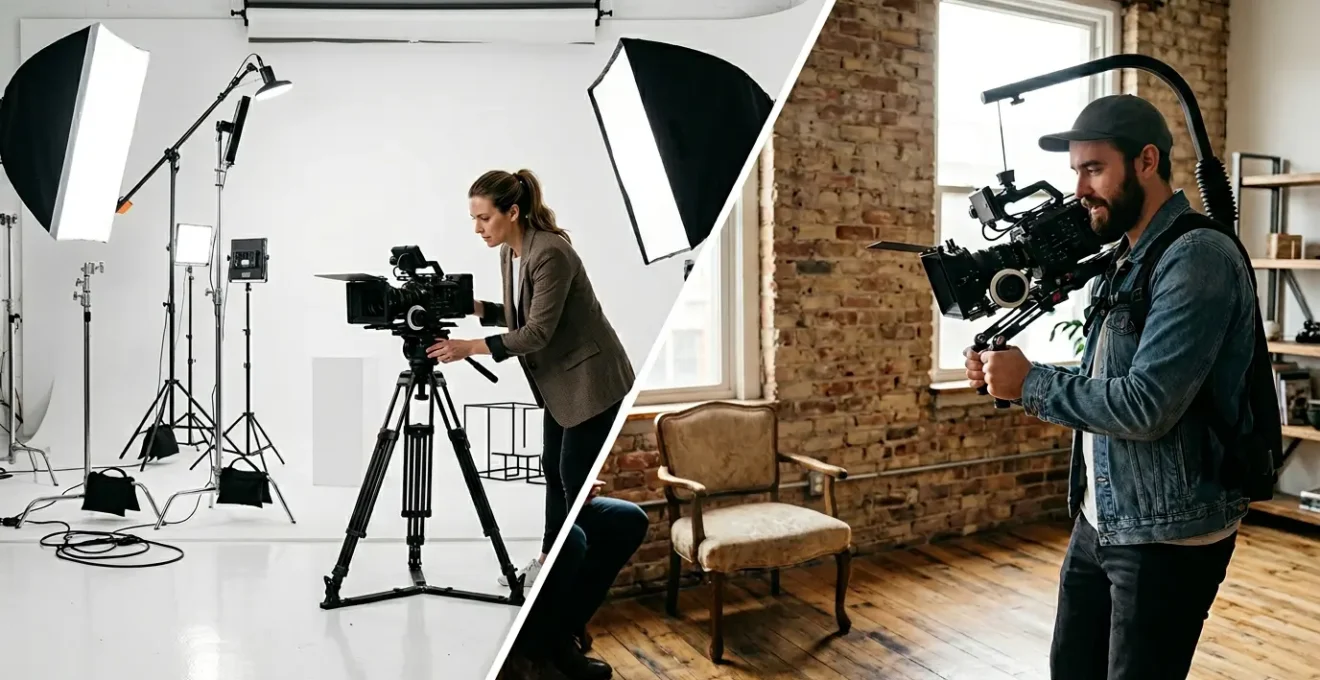
The visual style of your video isn’t decoration; it’s a core part of your brand’s messaging, capable of building or breaking trust in seconds.
- Lighting, lens choice, and color are not just technical details—they are the vocabulary of a « visual grammar » that communicates core values like trust, innovation, or authenticity.
- A mismatch between your brand’s identity (e.g., a prestigious law firm) and its video aesthetic (e.g., trendy glitch effects) can actively repel your target audience.
Recommendation: Stop choosing aesthetics based on trends. Instead, learn to deconstruct your brand’s core values and translate them into a deliberate, consistent visual identity that engineers the exact perception you want your audience to have.
As a founder, you’re tasked with building a brand from the ground up. Every choice matters, but few are as immediately impactful as the visual aesthetic of your video content. You’re likely debating between a polished, clean corporate look and a more authentic, gritty documentary style. The common advice is to simply « match your brand, » but what does that truly mean? Many brands default to sterile, brightly-lit explainers or chase fleeting trends, hoping to appear modern. This often results in a visual identity that is generic at best and, at worst, sends a message that’s completely at odds with their core values.
The problem is that most discussions about video aesthetics remain on the surface level. They focus on the « what »—like using certain colors or effects—without ever exploring the « why. » They fail to equip you, the visionary, with the strategic framework needed to make these critical decisions. But what if the key wasn’t about choosing between « clean » and « gritty, » but about understanding the visual grammar that makes an aesthetic feel a certain way? What if you could learn to deliberately engineer your audience’s perception by mastering the language of light, color, and texture?
This is not a technical manual for cinematographers. This is a strategic guide for founders. We will move beyond fleeting trends to establish a timeless visual strategy. We’ll deconstruct the core components of a video aesthetic, showing you how to translate your most fundamental brand values into a tangible, memorable, and effective visual signature. You will learn not just what choices to make, but why they work, empowering you to direct your creative teams with clarity and confidence.
This article provides a complete framework for defining, implementing, and evolving your brand’s video aesthetic. The following sections will guide you through the strategic decisions that transform a simple video into a powerful piece of brand storytelling.
Summary: Corporate Clean or Gritty Doc-Style: Which Aesthetic Fits Your Brand Story?
- Why Flat Lighting Says « Comedy » and Shadows Say « Drama »?
- How to Create a Mood Board That Accurately Communicates Vibe to a DP?
- Vintage Glass or Sharp Modern Lenses: Which Convey « Authenticity »?
- The Aesthetic Mistake of Using Glitch Effects on a Law Firm Video
- When to Rebrand Your Video Look: Signs Your Style is Outdated?
- How to Write a Video Style Guide That Freelancers Actually Follow?
- Why Warmer Tones Increase Trust in Financial Services Videos?
- How to Translate Brand Guidelines into a Video Colour Palette?
Why Flat Lighting Says « Comedy » and Shadows Say « Drama »?
Lighting is the first and most fundamental tool in your visual grammar. It’s not just about visibility; it’s about sculpting emotion and guiding perception. The distinction between flat, bright lighting and a more dramatic, shadow-filled approach is a foundational choice that telegraphs your brand’s personality before a single word is spoken. This isn’t just an artistic theory; it directly impacts how your brand is perceived, as 89% of consumers say video quality—of which lighting is a key component—impacts their trust in a brand.
To understand this, look at established visual codes. Flat, high-key lighting, which minimizes shadows, creates a sense of openness, clarity, and friendliness. It’s the default for comedies and news broadcasts because it feels straightforward and hides no secrets. For a startup, this can communicate transparency and accessibility. In contrast, dramatic, low-key lighting (like Chiaroscuro or Rembrandt lighting) uses deep shadows and high contrast to create mystery, prestige, and seriousness. It’s the language of thrillers, luxury brands, and dramatic storytelling, suggesting depth and a world of importance.
Case Study: Tech Transparency vs. Luxury Exclusivity
Consider the visual strategies of different sectors. Tech brands like Warby Parker often utilize bright, even lighting in their campaigns. This aesthetic choice aligns perfectly with their brand values of transparency, simplicity, and customer-friendliness. The light feels honest and approachable. Conversely, luxury watch or automotive brands almost exclusively use dramatic, shadow-rich lighting. This sculpts their products like art, creating a sense of exclusivity, heritage, and high-stakes prestige. They aren’t just selling a product; they are selling status, and the shadows are as important as the light in crafting that narrative.
The image below starkly contrasts these two worlds. On one side, the even illumination feels open and direct. On the other, the interplay of light and shadow creates a mood of sophistication and intrigue. Your choice between these is a strategic declaration of your brand’s core emotional signature.

Ultimately, the lighting style you choose sets the stage for your entire brand story. Are you an open book, or are you a well-kept secret? Answering this question is the first step in translating your brand’s soul into a visual reality. This decision informs every other aesthetic choice you will make.
How to Create a Mood Board That Accurately Communicates Vibe to a DP?
Once you have a conceptual grasp of your desired aesthetic, the next challenge is translating that vision into actionable instructions for your creative team, particularly the Director of Photography (DP). A vague brief like « make it feel premium » is a recipe for expensive reshoots. The mood board is your primary tool for this translation, serving as a visual contract that aligns the entire production team around a specific look and feel. A great mood board isn’t just a collage of pretty pictures; it’s a curated argument for your brand’s visual world.
Forget the old way of organizing by shot type (wide, medium, close-up). A far more effective method is to structure your mood board around the emotional journey of your story. Your brand video likely has emotional chapters: a moment of frustration (the customer’s problem), the introduction of the solution (your product), and the ultimate success or relief. Each of these « beats » requires a distinct visual treatment that your mood board should define with precision. This includes references for:
- Lighting: Does the « frustration » scene use cooler, harsher light, while the « success » scene is bathed in warm, soft light?
- Color Palette: Show the specific hues for wardrobe, props, and locations for each emotional beat.
- Texture: Include images of surfaces—smooth glass, rough concrete, soft fabric—that evoke the desired tactile feeling.
- Pacing: Even still images can suggest rhythm. Contrast chaotic, busy frames with calm, minimalist ones to guide the editing style.
A powerful, and often overlooked, technique is the creation of an « anti-mood board. » This is a section dedicated to images and styles you must actively avoid. It’s just as important to define what your brand is *not* as it is to define what it is. Is it too corporate? Too grungy? Too trendy? The anti-mood board eliminates ambiguity and protects your brand’s identity. For maximum clarity, consider creating a 30-60 second « vibe reel »—a short video edit of existing clips, music, and even animated keywords that encapsulates the energy you’re aiming for. This moves beyond static images to communicate the dynamic soul of your vision.
Vintage Glass or Sharp Modern Lenses: Which Convey « Authenticity »?
The debate over authenticity is central to modern branding. Audiences are increasingly skeptical of overly polished, slick marketing. In fact, research reveals that 75% of consumers say it’s more important for marketing videos to be authentic than polished. One of the most subtle yet powerful tools for engineering this feeling of authenticity is your choice of camera lenses. The decision between using vintage lenses or their modern, clinically sharp counterparts is a profound statement about your brand’s character.
Modern lenses are masterpieces of optical engineering. They are designed for flawless sharpness, high contrast, and zero distortion. This creates a clean, crisp, and hyper-realistic image. This look communicates precision, innovation, clarity, and professionalism. It’s the natural choice for tech companies wanting to showcase their cutting-edge UI, financial institutions needing to project stability and clarity, or healthcare brands where precision is paramount. The message is: « We are modern, we are accurate, and we have nothing to hide. »
Vintage lenses, on the other hand, are prized for their « imperfections. » They often produce softer images, unique lens flares, and subtle color shifts. These characteristics create a sense of warmth, nostalgia, and human touch. This aesthetic feels less manufactured and more artisanal. It’s perfect for a craft brewery celebrating its heritage, a luxury fashion brand evoking timeless elegance, or a founder telling a personal origin story. The message here is: « We have a soul, a history, and we were made with care by human hands. » The softness of the image feels more like a memory than a high-definition recording, fostering a deeper emotional connection.
The right choice depends entirely on what « authenticity » means for your specific brand. Is your authenticity rooted in technological superiority and transparent processes, or in heritage, craft, and a human-centric story? The table below, inspired by an analysis of brand video production trends, breaks down how these choices translate into audience perception.
| Lens Type | Brand Message | Audience Perception | Best Use Case |
|---|---|---|---|
| Vintage Glass | Heritage, Craft, Warmth | Artisanal, Premium, Nostalgic | Luxury goods, Craft brands |
| Modern Sharp | Precision, Innovation, Clarity | Professional, Cutting-edge | Tech, Finance, Healthcare |
| Hybrid Approach | Balanced, Versatile | Approachable yet Professional | Consumer brands, Services |
Ultimately, the lens is a storyteller. Choosing one is not a technical decision left to the DP; it’s a strategic brand decision that should be made by you. It’s a subtle but critical layer in your visual grammar that defines how genuinely your story is received.
The Aesthetic Mistake of Using Glitch Effects on a Law Firm Video
Aesthetic cohesion is paramount. The most dangerous mistake a brand can make is adopting a visual trend that fundamentally clashes with its core identity. Imagine a video for a prestigious, century-old law firm. The message is about stability, trust, and unwavering expertise. Now, picture that video incorporating trendy, fast-paced « glitch » effects and distorted transitions, simply because they are popular on social media. The result is a jarring aesthetic dissonance that instantly shatters credibility. The visual language (chaotic, modern, unstable) is screaming the exact opposite of the brand’s verbal message.
This is not just a matter of taste; it’s a strategic failure. Every visual element must serve the brand’s core values. A brand’s aesthetic is a promise. For a law firm, the promise is reliability. Glitch effects promise disruption and novelty. When the promises don’t align, the audience feels a sense of unease and mistrust, even if they can’t articulate why. The founder of a B2B SaaS company might rightly choose a « glitch » aesthetic to signify disruption of an old industry, but for the law firm, it’s poison.
The key is to always work backward from your brand’s foundational pillars. Before choosing any effect, style, or technique, ask: « What value does this visual choice communicate? » and « Does that communication reinforce or contradict our core brand message? » Successful brand videos master this alignment. For example, a campaign for a project management tool might use tongue-in-cheek humor and slick UI animations to make the dry topic of workflow accessible and engaging, as Vidico did for Cascade. This approach was a success because the aesthetic (clever, clean, efficient) perfectly matched the product’s promise, resulting in high engagement.

Your role as a founder is to be the guardian of this coherence. You must have the confidence to reject a popular trend if it doesn’t serve your story. True visual power comes not from being the most fashionable, but from being the most thematically consistent. Don’t let your brand’s video fall into the trap of trying to be cool at the expense of being credible. The aesthetic must always be the servant of the brand’s soul, never its master.
When to Rebrand Your Video Look: Signs Your Style is Outdated?
A video aesthetic, no matter how well-conceived, is not meant to be permanent. Markets evolve, competitors adapt, and your own company grows. Clinging to an outdated visual style can make your brand seem stagnant or out of touch. Recognizing the signs that it’s time for a refresh is a crucial strategic skill. This isn’t about chasing trends, but about ensuring your visual language continues to accurately represent your brand’s current identity and resonates with your target audience.
The most obvious red flag is declining engagement metrics. If you notice a sustained drop in video completion rates or click-through rates across multiple new videos, it could be a sign of « aesthetic fatigue. » Your audience may have become so accustomed to your look that it no longer captures their attention. However, data is just one piece of the puzzle. Strategic business triggers are often more powerful indicators. Has your company recently pivoted its mission? Are you targeting a new demographic? Have you gone through a merger or acquisition? Any significant change in business strategy demands a corresponding evaluation of your visual strategy.
Competitive analysis is also vital. If all your direct competitors have adopted a similar look, your once-unique aesthetic may now just be part of the noise. This presents a powerful opportunity to differentiate by evolving your style. Look for the visual territory they *aren’t* occupying. Finally, platform changes themselves can necessitate a style refresh. The rise of vertical video formats like Instagram Reels and TikTok demands a faster-paced, more dynamic editing style than traditional widescreen YouTube content. Forcing an old aesthetic into a new container rarely works.
The key is to think in terms of evolution, not revolution. A complete and sudden overhaul can alienate your existing audience and discard valuable brand equity. Instead, test incremental changes. Introduce a slightly updated color grade, experiment with a new font for your titles, or adjust the pacing of your edits. A well-managed aesthetic rebrand is a gradual process that brings your audience along with you, ensuring your brand story remains fresh, relevant, and powerful.
Your Action Plan: Auditing Your Video Aesthetic
- Monitor Completion Rates: A sustained decline across multiple new videos is a strong signal of aesthetic fatigue and audience disinterest.
- Track Business Triggers: Major company pivots, mergers, or targeting new demographics are non-negotiable moments to reassess your visual identity.
- Analyze Competitor Aesthetics: When your visual style becomes indistinguishable from your competitors’, a clear opportunity to differentiate and stand out exists.
- Review Platform Changes: The demands of new formats like TikTok or Reels may require a fundamental adaptation of your pacing, framing, and graphic style.
- Test Incremental Changes: Prioritize gradual evolution over a sudden revolution to maintain brand equity while demonstrating relevance and modernity.
How to Write a Video Style Guide That Freelancers Actually Follow?
Defining your aesthetic is only half the battle. The real challenge is achieving consistency, especially when working with external partners like freelance videographers or agencies. Without a clear, practical guide, your carefully crafted brand look will quickly dilute into a series of disconnected one-offs. A video style guide is the tool that codifies your visual grammar, but its effectiveness hinges on one thing: usability. An overly complex, 100-page document will be ignored. A guide that freelancers *actually* follow is concise, practical, and built for speed.
The most effective guides prioritize utility over exhaustive detail. While a section on brand philosophy is helpful for context, freelancers under a deadline will gravitate towards tools that provide immediate answers and save them time. This is why project templates and asset libraries are so critical. Providing an Adobe Premiere Pro or Final Cut Pro project template with your branded titles, lower thirds, and color grading presets already built-in is the single most effective way to ensure consistency. It removes guesswork and reduces decision fatigue.
The format of the guide itself matters immensely. Instead of a dense PDF, consider a modular approach. A one-page « cheat sheet » is invaluable for quick reference on set or during an edit. It should summarize the absolute essentials: key color codes, font names, logo usage rules, and a few bullet points on the desired tone. This cheat sheet can link to more detailed resources, like a full asset library with downloadable logos, music tracks, and graphic elements. The goal is to make doing the right thing the easiest possible path for your creative partners.
As the table below shows, components that offer direct, practical help have the highest adoption rates among creative professionals. A well-organized library of assets and pre-built templates will have a far greater impact on consistency than a long-winded explanation of your brand’s « essence. »
| Component | Adoption Rate | Impact on Consistency |
|---|---|---|
| One-page cheat sheet | 92% | High – Quick reference increases usage |
| Project templates | 85% | Very High – Reduces decision fatigue |
| Philosophy section | 73% | Medium – Helps with edge cases |
| Asset library | 88% | High – Direct time savings |
| Color LUTs | 79% | High – Instant brand consistency |
A great example is Storyblocks’ internal approach. Their dominant brand color is yellow, so they infuse splashes of yellow across their videos and create color grading presets (LUTs) that incorporate this hue. This simple, repeatable system solidifies their signature look while also speeding up production for their entire team. Your guide should empower freelancers to be creative *within* your brand’s framework, not constrain them with rigid, impractical rules.
Why Warmer Tones Increase Trust in Financial Services Videos?
Color is one of the most potent, subconscious communicators in your visual arsenal. In sectors where trust is the primary currency, like financial services, color strategy is not an afterthought—it’s a critical business decision. For decades, the established financial world has leaned heavily on a palette of deep blues (stability, authority) and rich, warm tones (gold, amber, soft browns). This isn’t an accident. Warmer tones, reminiscent of firelight and sunshine, are psychologically associated with comfort, security, and human connection. A video for a traditional investment bank that uses a warm, cinematic color grade is subconsciously telling its audience: « We are established, we are safe, and there are real people here to guide you. »
This warmth helps to humanize what can often be perceived as a cold, impersonal industry. By softening the digital sharpness of the image and imbuing it with a golden hue, you create an atmosphere of approachability and reliability. This is particularly effective in testimonial videos, where the goal is to foster an emotional connection between the viewer and the client on screen. The warm grade makes the speaker feel more like a trusted friend sharing advice than a paid actor reading a script. It bridges the gap between the institution and the individual.
However, this established visual grammar is now being strategically challenged. As one modern video production analysis notes, a new generation of FinTech companies is deliberately choosing a different path.
A new generation of FinTech companies can stand out by using cooler, cleaner, more neutral palettes. This aesthetic choice communicates ‘technology,’ ‘clarity,’ and ‘efficiency’ to a younger, tech-savvy audience.
– Industry Analysis, Modern Video Production Trends
This is a brilliant example of intentional dissonance. These challenger brands are breaking the established code to signal that they are different. Their cool, almost clinical aesthetic says, « We are not the old guard. We are a technology company first. » This appeals directly to a demographic that values efficiency and digital-native design over traditional notions of institutional comfort. Therefore, your choice of color temperature is a declaration of identity: are you the trusted, established advisor, or the lean, efficient disruptor?
Key takeaways
- Your video aesthetic is a strategic tool for engineering audience perception, not just a stylistic choice.
- Every element—from lighting and lens choice to color grading—is part of a « visual grammar » that communicates your brand’s core values.
- Consistency is key. A practical, user-friendly video style guide is essential for scaling your visual identity with freelancers and agencies.
How to Translate Brand Guidelines into a Video Colour Palette?
Your company’s brand guidelines likely have a well-defined color palette, but translating those static corporate colors into a dynamic, three-dimensional video world is a sophisticated process. Simply splashing your primary brand color everywhere will result in a video that looks flat and cartoonish. A successful video color strategy involves creating a hierarchical and context-aware system that feels both branded and natural.
A foundational principle for this translation is the 60-30-10 rule, adapted for video. This framework provides balance and visual appeal: 60% of your scene should be a dominant, often neutral, color (e.g., the walls of an office, the background); 30% should be a secondary color (e.g., the talent’s wardrobe, key furniture); and 10% should be a vibrant accent color, which is the perfect place for your primary brand color (e.g., a prop like a coffee mug, a book on a shelf, or a graphic element). This ensures your brand color is present and memorable without overwhelming the frame.
It’s also crucial to differentiate between in-world color and grading color. In-world color refers to the physical objects in your scene (props, wardrobe, art direction). This is where you strategically place your 60-30-10 palette. Grading color, on the other hand, is the overall hue applied in post-production. Your color grade should complement the in-world palette, not fight it. For instance, you might have a scene with a blue couch (in-world), but apply a warm, golden grade (grading color) to evoke a feeling of comfort.
Finally, a single palette is not enough. Your brand needs sub-palettes for different storytelling contexts. Your brand story or « anthem » video might use a highly cinematic and desaturated sub-palette to feel epic. A customer testimonial might use a warmer, more intimate sub-palette to build trust. A product demo, however, would benefit from a clean, clinical sub-palette with high contrast to emphasize clarity and detail. Documenting these sub-palettes, along with specific Kelvin values for lighting, ensures every piece of video content feels like it belongs to the same cohesive universe, no matter the context.
Your video’s visual aesthetic is your brand’s first handshake. By moving beyond surface-level trends and mastering the visual grammar of storytelling, you can ensure that handshake is firm, confident, and unforgettable. To begin defining or refining your brand’s unique visual signature, the next logical step is to build a mood board that translates these strategic principles into a clear, actionable creative brief.