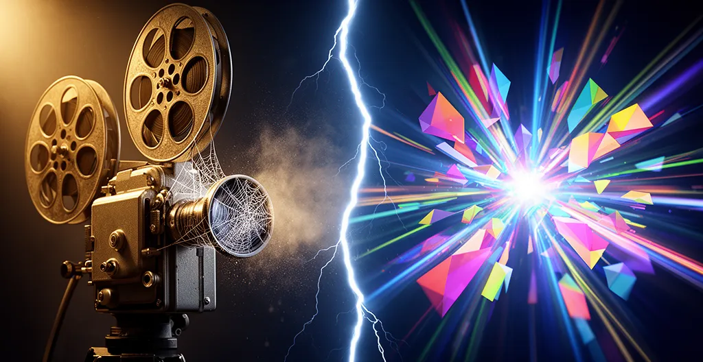
The professional, cinematic intro you spent weeks perfecting is the single biggest reason your viewers leave.
- It creates a « Promise Gap » by delaying the value your title and thumbnail promised.
- It spikes cognitive load with flashy visuals and loud audio before earning the viewer’s trust.
Recommendation: Delete it. Deliver the hook in the first three seconds, then earn the right to a two-second brand slate, not the other way around.
You see it in your YouTube Studio analytics, and it’s a gut-wrenching sight: a steep, cliff-like drop in audience retention within the first 10 seconds. You followed the advice. You created a slick, professional, « cinematic » intro with a cool logo animation and epic stock music. So why are people leaving in droves before your content even begins? The common advice is to « make your intro shorter » or « have a better hook, » but this feedback is dangerously incomplete. It treats the symptom, not the disease.
The core problem isn’t the length of your intro; it’s the gap it creates. This is the « Promise Gap »—the delay between the value proposition in your thumbnail and title, and the moment you actually start delivering on that promise. Every second a viewer spends watching your logo spin, they are not getting the answer, the entertainment, or the transformation they clicked for. This isn’t just a delay; it’s a broken contract with your audience, and it’s killing your channel’s growth.
This guide offers a new, ruthless philosophy for video intros. We won’t be discussing how to make your intro « prettier. » We will deconstruct why most intros fail from a cognitive and strategic standpoint. We’ll analyze the critical mistakes in visuals, audio, and pacing that push viewers away, and provide an actionable framework to build videos that command attention from the very first frame. It’s time to stop building intros and start building unrelenting engagement.
To navigate this strategic shift, we will dissect the most common retention-killing mistakes and provide a new editing philosophy. This breakdown will give you the tools to analyze your own content with a strategist’s eye and make the ruthless cuts necessary for growth.
Summary: The Ruthless Strategist’s Playbook for Winning the First 3 Seconds
- Why Viewers Skip Your « Cinematic » Montage Intro?
- How to Place the Hook Before the Intro Sequence?
- Interactive End Screen or Fast Loop: Which Keeps Viewers on Channel?
- The Audio Mistake Where the Intro is 5dB Louder Than the Speech
- When to Trigger the End Card Elements for Maximum Click-Through?
- Why Fancy Transitions Often Distract from the Message?
- Why Your On-Screen Text is Too Fast for the Average Reader?
- How to Use Invisible Cuts to Keep Viewers Watching Longer?
Why Viewers Skip Your « Cinematic » Montage Intro?
Viewers skip your cinematic intro because it represents a broken promise and an immediate cognitive burden. When a person clicks on your video, their brain is seeking the immediate fulfillment of the promise made by your title and thumbnail. Instead, a cinematic intro serves them a montage of disconnected B-roll, a spinning logo, and music that has no relation to the core topic. This creates a « Promise Gap » that is fatal for retention. The viewer’s unspoken question is, « Is this the right video for me? » and your intro is screaming, « Wait and find out. » In the age of infinite content, nobody waits.
Furthermore, these intros dramatically increase cognitive load. The viewer is forced to process unfamiliar visual information without any context or value. This isn’t engaging; it’s taxing. The most common mistake is the « slow build » approach, where creators ease into their content. This might feel artistic, but for an audience conditioned by platforms like TikTok and YouTube Shorts, it’s an immediate signal to swipe away. They don’t need your backstory; they need a reason to care, and they need it now. The data is unforgiving in this regard; a comprehensive report analyzing millions of minutes of watch time confirms that viewer drop-off is most severe at the very start.
The brutal truth is that viewers don’t care about your brand until you’ve given them a reason to. Your intro is a request for attention, but you haven’t yet earned the right to ask for it. The solution isn’t a shorter intro; it’s no intro at all. You must deliver value first, hooking the viewer immediately, before ever considering showing them a brand graphic.
How to Place the Hook Before the Intro Sequence?
The only effective strategy is to eliminate the traditional intro entirely and replace it with a powerful, value-driven hook that precedes any branding. This means the very first frames of your video must either state the problem, show the spectacular end result, or create a powerful information gap that compels the viewer to stay for the answer. Think of it as delivering the punchline before the joke’s setup. For example, a video titled « Building a Waterproof Treehouse » should open with a shot of the finished treehouse being drenched by a firehose, not with shots of cutting wood.
This « result-in-advance » method is just one of several hook types that are brutally effective in the first three seconds. The key is to select the right hook for your content type to create an immediate connection with the viewer. A controversial opinion can trigger curiosity in a debate video, while a direct question immediately creates an information deficit in an educational one.
The following table breaks down the most effective hook types and their impact on retaining viewers past the critical three-second mark. According to retention-focused analysts, a well-executed pattern interrupt or result-in-advance hook can have a significant positive effect on initial viewership.
| Hook Type | Description | Best For | Retention Impact |
|---|---|---|---|
| Result-in-Advance | Show the spectacular end result first | Tutorials, transformations | +23% retention rate |
| Question Hook | Pose the central problem immediately | Educational content | Creates information gap |
| Pattern Interrupt | Unexpected visual or audio element | Entertainment content | 23% higher retention in first 5 seconds |
| Contrarian Hook | State a controversial opinion | Opinion/debate content | Triggers curiosity |
After you have hooked the viewer and delivered a substantial portion of your content’s value, you may have earned the right to a 1-2 second brand slate or logo reveal—but never before. It’s a reward for the viewer’s attention, not a toll to be paid at the entrance.
Interactive End Screen or Fast Loop: Which Keeps Viewers on Channel?
The choice between an interactive end screen and a fast loop is not a matter of preference but a strategic decision dictated by the platform and your retention goal. For traditional, long-form YouTube content, the interactive end screen is your primary tool for guiding viewers to their next logical step, thus keeping them within your channel’s ecosystem. Its purpose is to prevent the viewer from returning to the YouTube homepage or, worse, being served a competitor’s video. When executed correctly, it’s a powerful driver of session watch time.
For short-form content (like YouTube Shorts or TikTok), the fast loop or « rewatchable content loop » is king. These platforms’ algorithms heavily favor rewatches as a signal of high engagement. A seamless loop, where the end of the video flows perfectly back into the beginning, encourages viewers to watch multiple times, often without realizing it. This sends a powerful signal to the discovery system to push your content to a wider audience. Combining this with a strong hook and strategic hashtags creates a potent engine for virality.
The most advanced strategy, however, is a hybrid approach. This involves creating a « soft loop » where the content feels like it could restart, but you strategically overlay end screen elements in the final moments. This caters to both viewer types: those who are ready to click to the next video and those who might be compelled into a rewatch if nothing is presented.
This visual concept shows how a video timeline can be structured to facilitate this hybrid model. It’s not a binary choice but a spectrum of strategic options to maximize on-platform time.
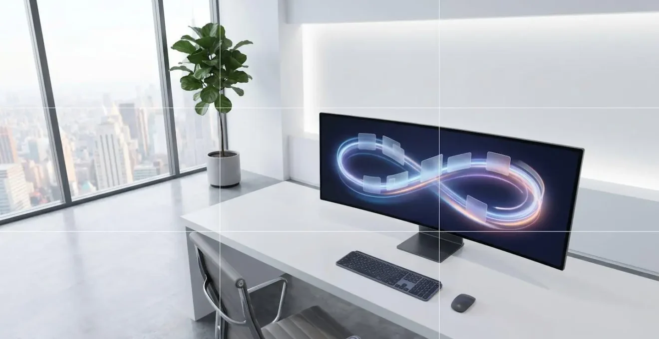
Ultimately, the goal is the same: control the viewer’s journey. Don’t let your video simply end. Either loop it to boost engagement metrics or direct it to keep the viewer consuming your content. A dead-end video is a missed opportunity.
The Audio Mistake Where the Intro is 5dB Louder Than the Speech
This is perhaps the most disrespectful and viewer-repellent mistake a creator can make. A sudden, jarring spike in audio volume from intro music that is significantly louder than the main speech content is a physical assault on the viewer’s senses. It forces them to lunge for the volume controls, breaking their immersion and creating an immediate negative association with your channel. It’s the digital equivalent of being screamed at by a salesperson the moment you walk into a store. The viewer’s immediate reaction is not just annoyance, but a feeling of being ambushed. This single mistake can undo all the hard work of a good hook.
The issue stems from a fundamental misunderstanding of audio mixing and platform normalization. Creators often mix their music to « feel » energetic, using peak meters, while speech is recorded at a more moderate level. However, platforms like YouTube don’t operate on peaks; they use a loudness normalization standard called LUFS (Loudness Units Full Scale). YouTube targets -14 LUFS to ensure a consistent listening experience across all videos. If your intro music is mixed significantly above this target, YouTube’s algorithm will compress it, but the perceived difference between the loud music and your quieter speech will still be jarring.
True audio discipline means your entire video, from the first second to the last, should have a consistent perceived loudness. The intro music, if you must have it, should be a bed *underneath* your speech, not a wall of sound that precedes it. Aim for a difference of no more than 3 LUFS between your loudest and quietest moments. Mastering this isn’t just a technical detail; it’s a sign of respect for your audience.
Action plan for loudness normalization
- Set your Target Loudness Level to -14 LUFS in your DAW or editing software.
- Monitor using the Integrated LUFS measurement (overall loudness), not just peaks.
- Keep your Short-term LUFS consistent throughout, avoiding spikes greater than a 3 LUFS difference.
- Maintain a True Peak at -1 dBTP to prevent distortion during platform compression.
- Use automation to balance intro music with speech, ensuring music is well below the speech level.
When to Trigger the End Card Elements for Maximum Click-Through?
The common practice of displaying all end screen elements—subscribe button, two video suggestions, a channel icon—simultaneously in the final 10 seconds is a strategic disaster. It’s a textbook example of triggering decision fatigue at the most critical moment. This approach is rooted in a fundamental misunderstanding of human psychology, specifically a principle known as Hick’s Law.
Hick’s Law states that the time it takes for a person to make a decision increases logarithmically with the number of choices available. By presenting a viewer with four different clickable options at once, you are not empowering them; you are paralyzing them. The cognitive load of evaluating « Should I subscribe? Watch this video? Or that other one? » often results in the viewer choosing none and simply letting the video end or clicking away.
Apply Hick’s Law (Paradox of Choice): Recommend against triggering all end screen elements at once
– User Experience Research, Decision fatigue in interactive video elements
A far more effective strategy is a sequential or « waterfall » trigger. Your call to action and end screen elements should appear one at a time, guiding the viewer’s choice rather than overwhelming them. For instance:
- 20-15 seconds before end: Verbal call to action for the *most important* next step. (« If you’re struggling with X, my video on Y is the perfect next step. »)
- 15 seconds before end: The single, most relevant video element appears on screen.
- 10 seconds before end: The subscribe button appears quietly in a corner.
- 5 seconds before end: A second, less critical video suggestion might appear.
This method respects the viewer’s cognitive limits. It presents a single, clear path forward before offering secondary options. By sequencing your calls to action, you transform your end screen from a confusing menu into a curated, persuasive pathway that dramatically increases click-through rates and session time.
Why Fancy Transitions Often Distract from the Message?
Fancy transitions—whip pans, glitches, page peels, and elaborate 3D effects—are the editing equivalent of empty calories. They feel substantial and look impressive on an editor’s showreel, but they provide zero nutritional value to the narrative. In fact, they actively damage retention by distracting from the message. The core issue is, once again, cognitive load. A simple cut is invisible; the brain processes it instantly without conscious effort. A flashy transition, however, is a loud visual event that demands the brain’s attention.
While the brain processes visual information in 13 milliseconds, it requires a much longer period of 2-3 seconds to make a conscious decision about engagement. When you insert a complex transition, you force the viewer’s brain to stop processing your *message* and start processing the *mechanics* of your edit. This interruption, however brief, breaks the flow of information and forces the viewer to re-engage with the content, a cognitive cost many are unwilling to pay. It’s a moment of distraction that provides a perfect opportunity for them to click away.
Effective editing is not about showing off your effects library; it’s about maintaining narrative momentum. The most successful creators use « Pattern Interrupts » that are meaningful and serve the story. As the Buffer case study famously showed, their retention skyrocketed not when they added fancy effects, but when they started using simple, purposeful interrupts like changing the camera angle, cutting to relevant B-roll, or using on-screen graphics to emphasize a point. These techniques keep the viewing experience dynamic without being distracting.
The rule is simple: if a transition doesn’t make the story clearer, it’s making it worse. A simple cut is almost always the right choice. Use a more complex transition only when you are intentionally trying to signify a major shift in time, location, or topic—and even then, use it sparingly.
Why Your On-Screen Text is Too Fast for the Average Reader?
Your on-screen text is too fast because you, the editor, are not reading it; you already know what it says. You place it on the timeline for a duration that « feels right » visually, but you fail to account for the cognitive process of an audience seeing it for the first time. This is a critical error, as text overlays are one of the most powerful tools for retention, especially in an era of mobile, sound-off viewing.
The most important function of text is to reinforce your hook and key messages for viewers who are not listening. As research from OpusClip points out, this is a massive segment of the audience.
Text overlays reinforce your verbal hook and ensure your message lands even when viewers watch with sound off, which happens more than 60% of the time on mobile. Keep text short, high-contrast, and on-screen for at least two seconds.
– OpusClip Research, YouTube Shorts Hook Formulas Study
To time your text correctly, you must be ruthless and data-driven. A simple, effective method is the WPM (Words Per Minute) formula. The average reading speed is around 240 WPM, which translates to 4 words per second. To calculate the base time your text should be on screen, divide the number of words by 4, and then add a 1-second buffer for cognitive processing. For example, a 12-word sentence requires a minimum of 4 seconds on screen (12 words / 4 wps = 3 seconds, + 1-second buffer). This is a baseline. A non-negotiable rule is to keep any text on screen for a minimum of 2 seconds, regardless of length, to ensure it even registers.
Finally, you must test your text’s readability under real-world conditions. Watch your video on a mobile device with the sound off. Can you comfortably read every piece of on-screen text? Is it large enough? Is the contrast high enough against the background? If you, the creator, feel rushed while reading it, your audience is certainly missing it entirely.
Key takeaways
- The « Promise Gap » between your title and your value delivery is your biggest enemy. Close it in under 3 seconds.
- Audio discipline is non-negotiable. A sudden volume spike is a sign of disrespect to the viewer. Aim for a consistent -14 LUFS.
- Edit for cognitive ease, not for your showreel. A simple, invisible cut is more powerful than a flashy, distracting transition.
How to Use Invisible Cuts to Keep Viewers Watching Longer?
Invisible cuts are the secret weapon of elite editors. They are the foundation of a pacing strategy that keeps viewers engaged without them ever knowing why. The philosophy was perfectly articulated by creator Mark Rober: « Every second of my video is precious. If a quarter second is not doing something in my video, I will cut it out. » This ruthless approach—using jump cuts and relentless visual edits to maintain momentum—is the essence of invisible editing. The goal isn’t to hide the cuts, but to make cuts so frequent and purposeful that the viewer has no time to get bored. The edit becomes a seamless flow of value.
Beyond the simple hard cut, two of the most powerful « invisible » techniques are J-Cuts and L-Cuts. These are audio-led edits that create a smooth, psychological bridge between two different shots. A J-Cut is when the audio from the next scene begins *before* the video cuts to it, creating anticipation. An L-Cut is when the audio from the current scene continues to play *after* the video has cut to the next shot, allowing an emotion or idea to linger. These are not flashy effects; they are sophisticated narrative tools.

Mastering these techniques allows an editor to control the emotional rhythm of a video. A fast-paced sequence of hard cuts creates tension and energy, while a well-placed L-cut provides a moment of reflection. The choice is always dictated by the story.
| Technique | Definition | When to Use | Emotional Impact |
|---|---|---|---|
| J-Cut | Audio from next scene plays before video cuts | Building anticipation, dialogue transitions | Creates forward momentum |
| L-Cut | Audio from current scene continues after video cuts | Lingering emotions, montages | Extends emotional resonance |
| Hard Cut | Audio and video cut simultaneously | Action sequences, emphasis | Creates ‘reset moment’ |
Using these cuts creates a viewing experience that feels effortlessly smooth and constantly engaging. The viewer isn’t consciously aware of the editing; they are simply captivated by the content. This is the hallmark of a master strategist: making complex work feel invisible to achieve a specific result.
The next time you open your editor, don’t ask « what can I add? ». Ask « what can I cut? ». That is the question that builds retention, grows channels, and respects the single most valuable commodity a viewer gives you: their time.