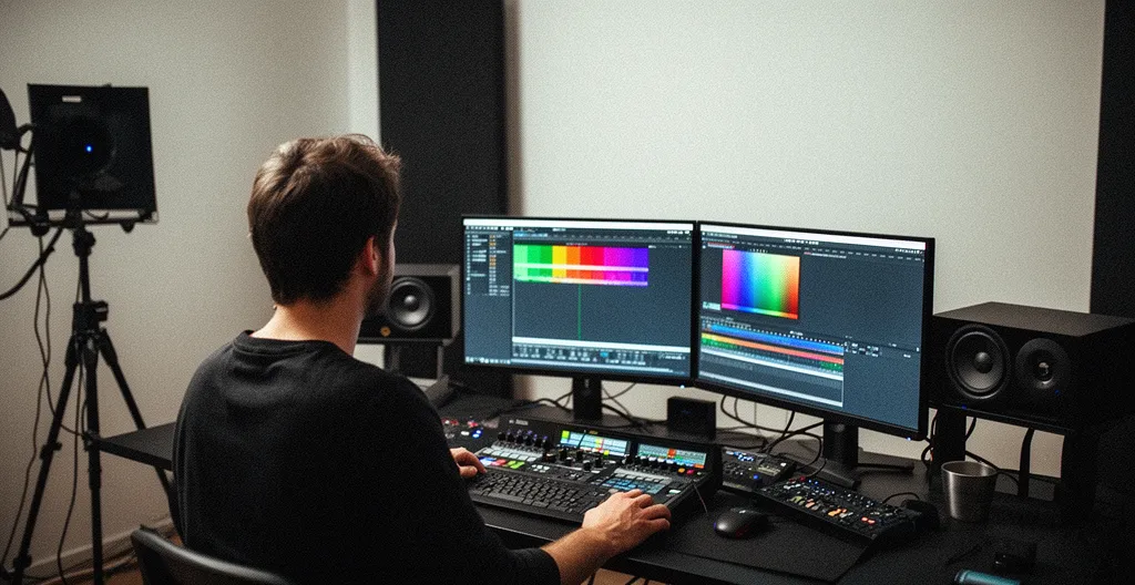
Colour consistency in video isn’t a creative choice—it’s an enforceable technical system.
- It relies on building custom LUTs (Look-Up Tables) that technically encode your brand’s visual DNA.
- Success requires a meticulously detailed video style guide that leaves no room for freelance interpretation.
Recommendation: Begin by auditing your current video output for colour consistency and draft a « Do and Don’t » visual guide to establish a baseline for your new governance framework.
For any brand manager, the disconnect is a familiar pain point. Your print and web assets are meticulously controlled, with HEX codes and Pantone values enforced with military precision. Yet, your video content often feels like the Wild West—a chaotic mix of colour temperatures, saturation levels, and moods that drift from one project to the next. The common advice to « just use your brand colours » is woefully inadequate for the moving image, a medium defined by light, shadow, and motion. This approach fails to address the fundamental challenge: the translation of a static identity into a dynamic, emotional experience.
The truth is that achieving brand consistency in video has little to do with simply dropping your primary colour into an end card. It’s about establishing a rigorous system of visual identity governance. This requires moving beyond abstract guidelines and building a technical framework that dictates how your brand is perceived in every single frame. The key isn’t to restrict creativity but to channel it through perceptual guardrails that protect and build brand equity. It involves a strategic translation of brand values into the technical language of colour grading, lighting, and cinematic mood.
This guide provides that framework. We will deconstruct the process of creating a robust video colour palette, moving from the psychological impact of tones to the hard science of building custom LUTs and enforceable style guides. This is your manual for transforming brand guidelines from a static document into a living, breathing, and consistent video identity.
Summary: From Brand Guidelines to a Cohesive Video Colour Strategy
- Why Warmer Tones Increase Trust in Financial Services Videos?
- How to Build a Custom LUT That Defines Your Corporate Visual Identity?
- Daylight vs Tungsten: How to Match Skin Tones Across Different Locations?
- The « Teal and Orange » Mistake That Dates Your Corporate Video Instantly
- How to Grade for Instagram’s Compression Without Losing Vibrancy?
- How to Write a Video Style Guide That Freelancers Actually Follow?
- Why Flat Lighting Says « Comedy » and Shadows Say « Drama »?
- Why Inconsistent Video Styles Confuse Customers and Dilute Equity?
Why Warmer Tones Increase Trust in Financial Services Videos?
The choice of colour temperature in video is not a purely aesthetic decision; it’s a strategic tool for psychological positioning. For sectors like financial services, where trust and security are paramount, warmer colour tones (those with a yellow, orange, or red bias) are instrumental. These tones evoke feelings of contentment, positivity, and approachability. They create a sense of comfort and human connection, which is critical when discussing sensitive topics like personal finance or investment. A video graded with a subtle warm cast can make an executive appear more like a trusted advisor than a distant corporate figure.
Conversely, cooler tones like blues and purples, while often associated with competence and modernity, can also signal coldness or sorrow if not handled carefully. This is why many tech and healthcare brands leverage them to signify precision and clinical efficacy. In finance, however, the goal is reassurance. A warmer palette, reminiscent of « golden hour » light, subconsciously tells the viewer that they are in a safe, stable, and positive environment. This emotional priming is foundational to building brand equity, as consistent visual cues reinforce the brand’s core promise. In fact, research shows that consistent color usage increases brand recognition by 80%, and that consistency begins with the foundational mood set by your colour temperature.
Ultimately, choosing warmer tones for financial services videos is a deliberate act of brand guardianship, ensuring the visual language aligns perfectly with the core message of trust.
How to Build a Custom LUT That Defines Your Corporate Visual Identity?
Building a custom Look-Up Table (LUT) is the most effective way to codify your brand’s visual identity into a reusable, technical asset for video production. A LUT is a file containing mathematical instructions to transform colour values, moving your footage from a flat, neutral state to a specific, on-brand look. It is the cornerstone of visual identity governance in video, eliminating the guesswork and subjective interpretation that leads to inconsistency. Instead of telling a freelancer to « make it feel warm, » you provide a LUT that *is* your brand’s definition of « warm. »
Creating this asset is a technical process that translates brand attributes into precise colour science. The goal is to create a « show LUT » that can be applied across all video projects, from high-budget brand films to quick social media clips, ensuring a consistent perceptual starting point. This process requires a deep understanding of both your brand’s personality and the tools of professional colour grading software like DaVinci Resolve.

This hands-on, precise adjustment is where abstract brand values become concrete colour decisions. The process requires a systematic approach to ensure the final LUT is both aesthetically pleasing and technically robust.
Your Action Plan: Creating a Brand-Aligned LUT
- Capture for Latitude: Start with footage shot in a wide-gamut, log profile (e.g., S-Log3, V-Log, B-RAW). This preserves the maximum amount of colour information for grading.
- Establish a Consistent Colour Space: Set your project’s colour management to a standardised system like ACES 1.3 or DaVinci Wide Gamut. This ensures the underlying mathematics of your colour transformations are consistent.
- Anchor Your Brand Palette: Pull your brand’s official HEX codes into your software’s vectorscope. Nudge the midtones and highlights of your image towards these specific coordinates to infuse the brand’s DNA directly into the look.
- Shape Contrast to Match Personality: Use lift, gamma, and gain controls or film-curve nodes to define contrast. A soft, low-contrast curve may suit a wellness brand, while a punchy, high-contrast look is better for a tech company.
- Apply Brand-Appropriate Texture: If your brand identity leans vintage or organic, consider adding subtle texture through film grain overlays or halation plug-ins. This final layer completes the tactile feel of your visual identity.
By investing in a custom LUT, you are creating a powerful tool for consistency that protects your brand’s visual equity across every video platform and every production.
Daylight vs Tungsten: How to Match Skin Tones Across Different Locations?
One of the most common failures in corporate video is inconsistent skin tones, a direct result of shooting under different lighting conditions. An interview shot by a window (cool, blue daylight) will look drastically different from one shot in an office with overhead lights (warm, orange tungsten). As a brand guardian, ensuring a consistent and flattering representation of people is non-negotiable. This requires a system for neutralizing colour casts at the source and finalizing them with a consistent grade.
A consistent color grade across all shots in your video is essential, especially when working with footage from different cameras or locations
– Miracamp Video Editing Guide, Learn Color Grading in Video Editing
The first step is to correctly white balance the camera on location, using a grey card to tell the camera what « true white » looks like under the prevailing light. This provides a neutral starting point. However, the strategic decision comes in post-production. Do you want to completely neutralize the light to create a uniform, « clean » corporate look, or lean into the natural warmth of tungsten for an intimate feel? The answer depends entirely on the brand personality you wish to convey.
The following table, based on an analysis of color theory in branding, breaks down how different colour temperatures align with specific brand applications, providing a framework for your decisions.
| Color Temperature | Emotional Association | Brand Application | Best Use Cases |
|---|---|---|---|
| Warm (2700-3500K) | Trust, comfort, nostalgia | Heritage brands, financial services | Testimonials, executive interviews |
| Neutral (4000-4500K) | Professional, balanced | Corporate, B2B services | Product demos, office settings |
| Cool (5500-6500K) | Modern, clinical, precise | Tech companies, healthcare | Laboratory scenes, tech showcases |
By defining a target colour temperature in your video style guide and using your custom brand LUT, you create a system that ensures all individuals representing your brand look consistent and professional, regardless of where they were filmed.
The « Teal and Orange » Mistake That Dates Your Corporate Video Instantly
For years, the « teal and orange » colour grade dominated cinema and, consequently, corporate video. This complementary colour scheme, which pushes skin tones towards orange and shadows towards a blue-green teal, became a visual cliché. While effective for creating immediate visual contrast, its overuse has rendered it a tell-tale sign of a dated and unoriginal production. For a brand aiming to appear modern, sophisticated, and forward-thinking, clinging to this trend is a critical mistake. It signals a lack of a unique visual identity and a reliance on generic, off-the-shelf looks.
As a brand guardian, your role is to steer your creative partners away from these visual crutches and towards a palette that is both contemporary and unique to your brand. The goal is to find a colour scheme that provides pleasing contrast and separation without defaulting to the expected. This involves exploring more nuanced complementary or analogous colour relationships that feel fresh and intentional. A distinctive colour palette is a powerful differentiator, making your content instantly recognizable in a sea of sameness.
Instead of the default teal and orange, consider palettes that offer more sophistication. The key is to find a combination that aligns with your brand’s personality while still providing enough separation to create a dynamic and visually interesting image. Here are some modern alternatives to consider for your brand’s visual identity:
- Forest Green & Soft Magenta: Creates a sophisticated, high-fashion contrast without the dated feel of teal and orange.
- Deep Indigo & Mustard: Offers unique brand differentiation while maintaining a strong, pleasing complementary harmony.
- Mint & Terracotta: Provides a fresh, contemporary feel suitable for lifestyle, wellness, and modern consumer brands.
- Monochromatic with a Single Accent: Use varying shades of your brand’s primary colour (e.g., different blues) with one strategic pop of an accent colour for emphasis.
By consciously choosing a more distinctive palette, you move from a generic aesthetic to a deliberate and ownable visual signature, a core tenet of effective brand governance.
How to Grade for Instagram’s Compression Without Losing Vibrancy?
Creating a beautiful colour grade on a professional, calibrated monitor is one thing; ensuring it survives the brutal compression algorithms of social media platforms like Instagram is another. As a brand manager, you must ensure your video’s colours remain vibrant and on-brand, even on a poorly calibrated smartphone screen. This requires a specific, defensive approach to colour grading and exporting, anticipating how platforms will alter your work.
Instagram’s compression is particularly aggressive with colour information. It tends to crush blacks, desaturate subtle tones, and introduce colour banding in gradients. To counteract this, your colour grade needs to be slightly exaggerated. This means boosting saturation a little more than you think you need, ensuring your contrast has clean separation between blacks, mids, and whites, and avoiding extremely subtle colour shifts that will be lost entirely. The mantra is: if it’s subtle on your pro monitor, it will be invisible on a phone.
Furthermore, testing is non-negotiable. A critical part of the workflow is to export short test clips and view them on multiple devices—an iPhone, an Android phone, a tablet, a laptop. This reveals how your grade holds up in the real world and allows you to make final tweaks before the master export.
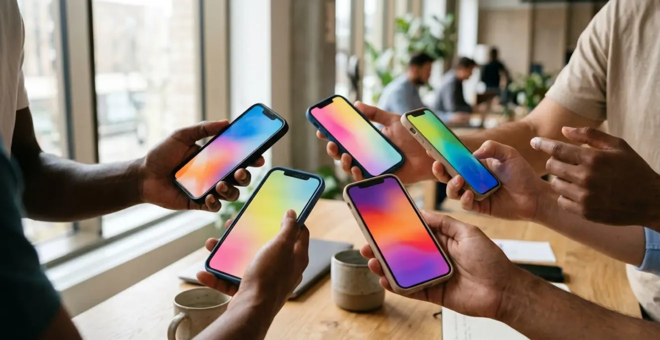
This real-world validation process is the only way to guarantee a consistent viewer experience. A platform-specific color optimization strategy involves several key actions to preserve your visual identity:
Platform-Specific Color Optimization Strategy
To ensure colour fidelity across platforms, a multi-step verification process is essential. First, view the video on multiple screens; test the graded footage on different devices (iPhones, Androids, tablets) to catch any undesirable colour shifts or compression artifacts. Second, optimize rendering for colour fidelity by using export settings and codecs (like H.264 with a high bitrate) that are known to preserve your graded colours during the export process. Finally, adjust for specific platforms by creating tailored exports for social media or streaming services, slightly boosting saturation or contrast to compensate for their unique compression algorithms. These targeted tweaks ensure your video’s colour grading holds up and remains consistent everywhere it’s viewed.
By grading defensively and testing rigorously, you can ensure the colour palette you so carefully crafted maintains its vibrancy and protects your brand’s visual consistency across all digital touchpoints.
How to Write a Video Style Guide That Freelancers Actually Follow?
A custom LUT is your technical tool for consistency, but your video style guide is your legal document. This guide is the single source of truth that translates your brand strategy into actionable, non-negotiable rules for anyone creating video content for you, especially external freelancers. A guide that is vague, overly complex, or lacks clear examples is a guide that will be ignored. To be effective, it must be visual, prescriptive, and practical.
The most common failure of video style guides is being too abstract. Phrases like « mood should be optimistic » are useless. Instead, the guide must provide concrete technical and creative parameters. It should show, not just tell. Including a « Do and Don’t » section with actual visual examples—a screenshot of an incorrectly graded shot next to a correctly graded one—is the most powerful tool at your disposal. This removes all ambiguity and provides an instant visual reference for what is acceptable and what is not.
Ultimately, a strong video style guide is an investment that pays significant dividends. By ensuring consistency, you are reinforcing brand identity at every turn. This consistency is directly tied to financial outcomes; studies demonstrate that maintaining consistent brand presentation across all channels generates approximately a 23% uplift in revenue. The guide is your primary tool for protecting that investment.
Checklist: Essential Components of an Effective Video Brand Guide
- Define Clear Colour Usage Rules: Specify exactly when and where to use brand colours. Should the primary blue only appear in the intro logo, or can it be a recurring accent colour on graphics throughout the video?
- Create Visual ‘Do and Don’t’ Examples: Show side-by-side comparisons of correctly graded footage (using your brand LUT) versus incorrectly graded or ungraded footage. Visualize what « too warm » or « too flat » looks like.
- Provide Concrete Technical Specifications: List required RGB/HEX values for graphics, the specific name of the brand LUT file to be used, the required colour space (e.g., Rec. 709), and standard export settings (codec, bitrate, resolution).
- Develop Tiered Guidelines for Different Content: A high-production brand film will have stricter rules than a 15-second Instagram Story. Create different tiers of guidelines for different types of content to maintain flexibility without sacrificing core identity.
- Include Downloadable Assets: Package the guide with a link to a folder containing all necessary assets: the official brand LUTs, colour reference charts (as .png files), logo files, and even short, sample graded clips for reference.
By creating a guide this thorough, you eliminate excuses and empower every creator to become a steward of your brand’s visual identity.
Why Flat Lighting Says « Comedy » and Shadows Say « Drama »?
Your video’s colour palette is only half the story; lighting is the other. The way you shape light and shadow communicates a tremendous amount about your brand’s personality before a single word is spoken. The ratio of key light (the main light source) to fill light (the light that « fills in » shadows) is a core determinant of this personality. A misaligned lighting style can send a conflicting message, undermining the trust you’ve built with colour.
High-key, or « flat, » lighting utilizes a low lighting ratio (e.g., 2:1), where the fill light is nearly as bright as the key light. This minimizes shadows, creating a bright, even, and open look. This style is subconsciously associated with honesty, transparency, and friendliness. It’s the native language of comedy and approachable daytime television for a reason: there are no dark corners, nothing is hidden. For brands with an « Innocent » or « Jester » archetype, this style is a perfect fit, making them feel accessible and trustworthy.
Conversely, low-key lighting uses a high lighting ratio (e.g., 8:1 or higher), with very little fill light. This creates deep shadows and high contrast, a style known as chiaroscuro. This is the language of drama, mystery, and prestige. The shadows create a sense of gravitas, exclusivity, and power. It’s ideal for luxury brands, high-end tech, or any organization with a « Ruler » or « Magician » archetype that wants to project an aura of premium quality and authority.
This matrix, based on professional cinematography principles and brand theory, provides a clear guide for aligning your lighting choices with your brand’s core identity.
| Lighting Style | Fill Ratio | Brand Archetype | Emotional Impact |
|---|---|---|---|
| High-Key (Flat) | 1:1 to 2:1 | Jester, Innocent | Approachable, friendly, transparent |
| Standard | 3:1 to 4:1 | Everyman, Caregiver | Natural, trustworthy, relatable |
| Low-Key (Dramatic) | 8:1 or higher | Ruler, Hero | Premium, exclusive, powerful |
| Chiaroscuro | 16:1 extreme | Magician, Outlaw | Mysterious, bold, transformative |
By specifying a target lighting ratio in your video style guide, you add another layer of control, ensuring your visual tone is perfectly and consistently aligned with your brand’s intended personality.
Key Takeaways
- Colour consistency in video is not a creative preference but a technical system rooted in governance, directly impacting brand recognition and revenue.
- A custom LUT is the cornerstone of this system, translating abstract brand values into a reusable, mathematical colour instruction that eliminates subjective interpretation.
- A video style guide is the enforcement document for this system, which must include visual « Do/Don’t » examples and precise technical specifications (colour values, lighting ratios) to be effective.
Why Inconsistent Video Styles Confuse Customers and Dilute Equity?
Every piece of video content is a brand touchpoint. When the visual style is inconsistent—a warm and friendly testimonial one day, a cool and clinical product demo the next—it creates a fractured and confusing brand experience. This visual dissonance erodes trust and dilutes brand equity. Customers subconsciously register the inconsistency, which can make the brand feel unreliable, unfocused, or even deceptive. The power of a brand lies in its predictability, and visual style is a primary component of that promise.
The initial judgment a customer makes about your brand is formed in milliseconds, and it is overwhelmingly visual. In fact, color psychology research reveals that up to 90% of snap judgments about brands are based on color alone. When that colour language changes from video to video, you are forcing the customer to re-evaluate who you are every single time. This constant re-evaluation prevents the formation of a strong, automatic brand association in the customer’s mind. The result is lower brand recall and a weaker emotional connection.
Brand Recognition Through Color Consistency
The emotional and commercial cost of inconsistency is significant. A study on brand loyalty found that one in three consumers reported they are more likely to remain loyal to brands that maintain a consistent colour scheme. More strikingly, 12% of consumers have stopped shopping with a brand entirely after it made a significant colour shift. This highlights a direct link between visual consistency and customer retention. The impact is emotional as well, with 18% of those surveyed reporting they felt emotionally disconnected from a brand after it changed its colours, proving that a stable visual identity is crucial for maintaining a strong customer relationship.
By implementing the systematic approach detailed throughout this guide—from custom LUTs to lighting rules—you are not just creating prettier videos. You are engaging in the critical work of brand guardianship: building and protecting your most valuable asset, the consistent and trustworthy perception of your brand in the mind of the customer.