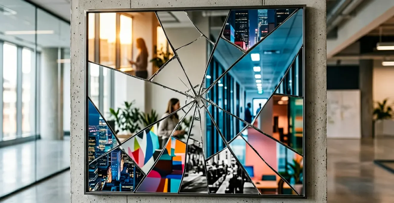
The root cause of brand dilution isn’t creative freedom; it’s the absence of a strategic Visual Operating System for video content.
- Inconsistency in micro-elements like fonts and frame rates actively damages brand recall and perceived value.
- Effective brand guides are not restrictive documents but scalable playbooks that empower creators with clear technical parameters.
Recommendation: Shift from policing brand elements to architecting a consistent visual system. Start by defining your non-negotiable « brand anchors » and codifying them in a modular video style guide.
Your social media team launches a series of gritty, fast-paced TikToks. Simultaneously, a high-budget TV spot airs, featuring polished, cinematic visuals. Both are meant to promote the same campaign, yet they feel like they originate from two different companies. This fragmentation is more than a simple aesthetic mismatch; it is an active and costly dilution of your brand equity. Every video that deviates from a core visual identity confuses the customer, erodes trust, and represents a wasted media spend.
The common response is to tighten brand guidelines, often leading to creative stagnation or, worse, guidelines that are simply ignored by busy freelancers and agencies. The standard advice to « be consistent » and « use your logo » is fundamentally insufficient for the dynamic and fragmented nature of modern video marketing. It fails to address the technical and psychological nuances that truly build recognition.
The solution is not to enforce rigid, monolithic rules. The key is to stop thinking of brand guidelines as a static document and start building a flexible, scalable Visual Operating System (VOS). This system translates abstract brand values into concrete, enforceable technical parameters—from font psychology and color grading to frame rate choices—that guide every creator. It provides a « creative sandbox » with firm boundaries, ensuring that even as you adapt to different platforms, your core brand identity remains intact and powerful.
This article will deconstruct the critical errors that lead to visual chaos and provide a strategic framework for building a robust VOS. We will explore how to codify your brand’s DNA into a practical style guide, make strategic tooling choices, and adapt your visual language for any platform without sacrificing an ounce of brand equity.
This guide provides a complete framework for diagnosing inconsistencies and implementing a unified visual strategy. Explore the sections below to master each component of your brand’s video identity.
Summary: Unifying Your Video Brand Identity
- Why Using Random Fonts in Video Reduces Brand Recall by 30%?
- How to Write a Video Style Guide That Freelancers Actually Follow?
- Canva Templates or Custom After Effects: Which Builds Stronger Recognition?
- The Frame Rate Mistake That Makes Your Campaign Feel Disjointed
- How to Adapt Your Visual Language for TikTok Without Breaking Brand Rules?
- How to Build a Custom LUT That Defines Your Corporate Visual Identity?
- How to Create a Mood Board That Accurately Communicates Vibe to a DP?
- Corporate Clean or Gritty Doc-Style: Which Aesthetic Fits Your Brand Story?
Why Using Random Fonts in Video Reduces Brand Recall by 30%?
Typography is not decoration; it is a subconscious signal. The choice of a font communicates personality, authority, and trustworthiness before a single word is read. When your videos use an arbitrary mix of fonts—a serif on Instagram, a sans-serif on YouTube, and a script font in a presentation—you are broadcasting an unstable and unprofessional identity. This typographic chaos directly undermines brand recall. The brain relies on consistent visual cues to build recognition pathways. Every inconsistency forces it to re-evaluate, weakening the connection between the content and your brand.
The psychological impact is significant. For example, the whimsical, playful lettering used by Disney instantly signals the brand’s magical and imaginative nature. This isn’t an accident; it’s a calculated part of their visual identity that creates instant recognition across all media. This consistency makes their brand feel reliable and coherent. Conversely, a financial services company using a flimsy, decorative font would immediately create cognitive dissonance and erode trust.
The failure to standardize typography is a critical flaw in any video strategy. It suggests a lack of attention to detail and a fragmented internal process, projecting weakness rather than strength. A strict, limited selection of primary and secondary brand fonts is non-negotiable. This isn’t about limiting creativity; it’s about building a clear, recognizable voice that reinforces your brand’s core attributes in every frame, from a 15-second social clip to a 30-minute documentary.
How to Write a Video Style Guide That Freelancers Actually Follow?
Most video style guides fail. They are either too vague (« videos should feel energetic ») or too rigid, becoming a PDF that gathers digital dust while freelancers default to their own habits. An effective guide is not a book of laws but a functional playbook—a core component of your Visual Operating System. Its purpose is to provide « technical empathy, » giving creators the specific parameters they need while explaining the strategic « why » behind each rule to encourage buy-in.
A guide that works is modular and practical. Instead of one monolithic document, develop separate but interconnected playbooks for different video formats. The rules for a fast-cut social media ad are different from those for a long-form customer testimonial. However, they must both draw from the same core brand DNA, such as a consistent color palette, logo placement, and typographic hierarchy. The goal is to create a « creative sandbox » where freelancers have clear boundaries but room to execute effectively within them.
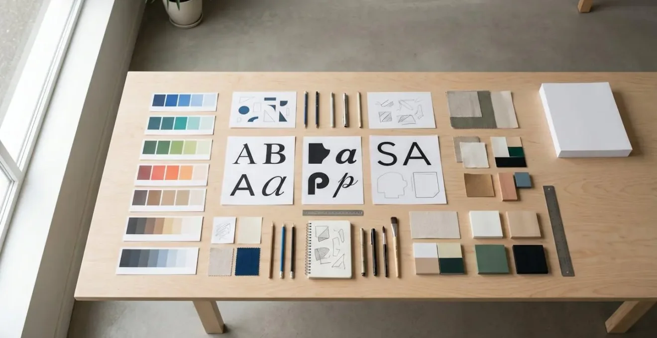
This modular approach, as visualized above, ensures that every creator has exactly the information they need, and no more. The key is to move from abstract descriptors to concrete instructions. Instead of saying « use our brand colors, » specify the hex codes and their roles (e.g., « Primary Blue #0A2F5B for text overlays, Accent Gold #FFC72C for call-to-action buttons »).
Action Plan: Building Your Video Style Guide
- Define Editing Style: Specify the use and timing of transitions, on-screen graphics, and audio mixing to create a consistent pace and feel that matches the brand’s personality.
- Codify Color & Logo Rules: Detail the specific hex codes for your color palette and create strict rules for logo placement, including safe zones, sizing, and intro/outro usage.
- Establish Typographic Hierarchy: Clearly define the font, weight, and size for headlines, subtitles, and body copy within videos to ensure readability and consistency.
- Create a Modular Format: Develop separate, concise playbooks for major video types like social media clips, product demos, and corporate interviews, each referencing the core brand rules.
- Explain the ‘Why’: For every major rule, include a brief sentence on the strategic reason behind it. This transforms a command into a shared goal, dramatically increasing freelancer compliance.
Canva Templates or Custom After Effects: Which Builds Stronger Recognition?
The choice between template-based tools like Canva and custom motion graphics from software like Adobe After Effects is a critical strategic decision, balancing speed, cost, and brand control. There is no single « correct » answer; the right choice depends on the video’s role in your marketing funnel. Treating a daily social media post with the same production process as a hero campaign video is a recipe for inefficiency and budget overruns.
Canva and similar template-based solutions offer unparalleled speed and scalability. They are ideal for high-volume, low-stakes content like daily social media updates or simple announcements. However, this efficiency comes at the cost of brand control. Relying solely on generic templates risks blending in with competitors and diluting your unique visual identity. Custom After Effects work, on the other hand, provides total brand control. It allows for the creation of truly unique motion identities, bespoke animations, and data visualizations that are impossible to replicate in template tools. This is the clear choice for « hero » content—high-impact brand films, product launches, and commercials where differentiation is paramount.
The most sophisticated strategies often use a hybrid approach, leveraging Motion Graphics Templates (MOGRTs). These are custom-built After Effects templates that can be used in editing software like Premiere Pro. A senior designer creates the core branded animation, locking down fonts, colors, and timings, while allowing editors to change specific text or images. This combines the brand control of custom work with the efficiency of a template, providing a powerful, scalable solution for regular branded content like video podcasts or series.
This comparative analysis from a recent breakdown of motion graphics solutions highlights the trade-offs:
| Aspect | Canva Templates | Custom After Effects | Hybrid (MOGRTs) |
|---|---|---|---|
| Brand Control | Limited – Generic look | Full control | High control with efficiency |
| Production Speed | Very fast | Slow | Moderate to fast |
| Cost | Low ($12-30/month) | High ($1000+ per video) | Moderate (template + customization) |
| Scalability | Excellent for volume | Limited by budget | Good balance |
| Best Use Case | Daily social posts | Hero content, campaigns | Regular branded content |
The Frame Rate Mistake That Makes Your Campaign Feel Disjointed
Frame rate (frames per second, or fps) is one of the most overlooked yet powerful tools in a video’s emotional arsenal. Most marketers treat it as a purely technical setting, but different frame rates trigger distinct psychological associations in the viewer’s mind. A mismatch in frame rate between your TV ad and your social media content can create a subtle but jarring sense of disjointedness, undermining the cohesion of your campaign.
The three standard frame rates each carry their own subconscious meaning. 24fps is the cinematic standard. The slight motion blur it creates is what audiences have been conditioned to associate with premium, narrative storytelling and high production value. 30fps is the standard for broadcast television, news, and live events. It feels clean, professional, and « real, » but lacks the « magical » quality of 24fps. 60fps provides a hyper-realistic, ultra-smooth look associated with sports broadcasting, video games, and slow-motion replays. When used for narrative content, it can trigger the « soap opera effect, » making a scene feel cheap or artificial.
The critical mistake is using these frame rates interchangeably. If your hero brand film is shot at a cinematic 24fps to evoke emotion and prestige, but your supporting product demos are shot at a hyper-realistic 60fps, the campaign will feel tonally inconsistent. The product will feel disconnected from the brand story. As research into the psychological associations of frame rate confirms, viewers perceive 24fps as more ‘cinematic’ due to the ~41.67ms interval between frames that produces a familiar motion blur.
Your Visual Operating System must dictate a clear frame rate strategy. For example: use 24fps for all top-of-funnel, story-driven content. Use 30fps for all middle-funnel, informational content like tutorials and corporate videos. Use 60fps only when capturing fast-moving action or for specific platforms that reward it. This technical decision is a creative one, and consistency here is crucial for building a cohesive brand world.
How to Adapt Your Visual Language for TikTok Without Breaking Brand Rules?
The mandate to « be platform-native » on channels like TikTok and Instagram Reels creates a significant challenge for brand consistency. These platforms reward raw, authentic, trend-driven content that seems diametrically opposed to polished, corporate brand standards. The solution is not to abandon your brand rules, but to strategically distinguish between your core, invariant brand anchors and the flexible, adaptive elements of your visual style.
Brand anchors are the non-negotiable pillars of your visual identity. These typically include:
- Color Palette: The core color grade or Look-Up Table (LUT) that gives all footage a consistent feel.
- Typography: The primary brand font used for essential information and subtitles.
- Logo Usage: The rules for placing your logo as a subtle watermark or end card.
- Core Messaging: The brand’s tone of voice and key value propositions.
These anchors must remain constant. The adaptive elements are everything else: pacing, editing style, use of trending audio, on-screen effects, and video format (e.g., 9:16 vertical). The goal is to pour your branded content into the native container of the platform.

This means your TikToks can and should feel like TikToks, but they should be unmistakably *your* TikToks. A user scrolling their feed should be able to recognize your content by its unique color grade or distinctive typography before they even see your logo. As platform analysis shows, adaptation is also technical; with up to 85% of social media videos being watched without sound, consistently styled and branded subtitles are no longer optional—they are a primary communication tool. Success on these platforms comes from maintaining brand essence while fluidly adapting its execution.
How to Build a Custom LUT That Defines Your Corporate Visual Identity?
Color is the most powerful and immediate way to communicate mood and brand identity in video. A custom Look-Up Table (LUT) is the ultimate tool for codifying your brand’s color science into a single, distributable file. A LUT is a set of instructions that tells editing software how to remap the colors of a video, ensuring that whether footage is shot on a professional cinema camera or an iPhone, it can be instantly transformed to fit your brand’s signature aesthetic. This is a cornerstone of a mature Visual Operating System.
Creating a strategic corporate LUT is a multi-step process. It begins not in software, but with strategy. You must first translate your brand’s core attributes into color theory. A brand that wants to be seen as « trustworthy and stable » might lean towards subtle boosts in blues and desaturated tones. An « energetic and bold » brand might use warmer, more saturated colors with higher contrast. This mood is then built into a creative LUT.
The process is both technical and creative. A professional colorist will typically:
- Translate brand keywords into a specific color palette and contrast curve.
- Create a technical LUT first, which corrects footage from various cameras (e.g., Log to Rec.709) to a neutral, standardized baseline.
- Apply a creative LUT on top of the corrected footage to impart the signature brand look.
- Develop a LUT family, including a primary « hero » LUT, a high-contrast version for dramatic scenes, and a version optimized for low-light or interview scenarios.
- Package and document the LUTs with clear instructions and preview images for distribution to all internal and external video creators.
The impact of this consistency is immense. Having a unified visual identity across all video content is a major driver of brand equity. In fact, studies on brand consistency demonstrate that a uniform visual presentation can increase brand recognition by up to 80%. A custom LUT is the most effective way to achieve this at scale.
How to Create a Mood Board That Accurately Communicates Vibe to a DP?
A common point of failure between a marketing director and a production team, especially the Director of Photography (DP), is a breakdown in visual communication. The term « mood board » is often used as a catch-all, leading to critical misunderstandings. A marketing director might present a collage of images to convey a « vibe, » but a DP needs technical, actionable direction. To bridge this gap, you must distinguish between a high-level Mood Board and a technical Visual Reference Deck.
A Mood Board is for internal alignment. Its purpose is to define the abstract, emotional territory of the campaign: the overall feeling, the color palette, textures, and general aesthetic. It answers the question, « What should this campaign feel like? » It is a collage of inspiration, often pulling from art, nature, and design.
A Visual Reference Deck, however, is a technical document created specifically for the DP and director. It moves from the abstract to the concrete. It deconstructs the mood into specific, executable shots. This deck should include example stills or video clips (with timestamps) that demonstrate precise lighting setups, camera angles, lens choices (e.g., « wide-angle for a sense of scale, » « shallow depth of field for intimacy »), and camera movement. Crucially, it must also include « anti-references »—examples of what *not* to do—to create clear boundaries.
As this comparative guide for video branding explains, failing to provide this level of technical specificity forces the production team to guess, often leading to costly reshoots or a final product that misses the strategic mark.
| Element | Mood Board | Visual Reference Deck for DP |
|---|---|---|
| Purpose | High-level vibe, color, texture | Technical shot planning |
| Content | Static images, color palettes | Shot examples, lighting diagrams, lens notes |
| Specificity | Abstract, emotional | Precise, technical |
| Anti-References | Optional | Critical – shows what to avoid |
| Organization | Thematic collage | Scene-by-scene breakdown |
| Media Types | Images, colors | Video clips with timestamps, annotated stills |
Key Takeaways
- Inconsistency is not a creative issue; it’s a systemic failure that actively erodes brand equity and customer trust.
- A Visual Operating System (VOS) that codifies brand rules into technical parameters is the only scalable solution for consistency.
- Success lies in balancing non-negotiable « brand anchors » (color, font) with flexible, platform-native execution.
Corporate Clean or Gritty Doc-Style: Which Aesthetic Fits Your Brand Story?
The final, and most strategic, decision in your Visual Operating System is defining your position on the aesthetic spectrum. This is the choice between a « corporate clean » look—polished, perfectly lit, stable—and a « gritty doc-style »—handheld, natural light, raw. This choice should not be based on current trends or the personal taste of the CEO. It must be a deliberate decision tied directly to your brand’s story, market position, and the specific objective of the content.
The corporate clean aesthetic projects authority, stability, and market leadership. It is highly effective for bottom-of-funnel (BoFu) content where clarity and trust are paramount. Think product specification videos, financial reports, or messages from leadership. The polished look reassures the viewer that they are dealing with a professional and reliable organization. The primary risk is appearing sterile, impersonal, or out of touch if not executed with care.

Conversely, the gritty doc-style aesthetic fosters authenticity, relatability, and emotional connection. It is a powerful tool for top-of-funnel (ToFu) awareness campaigns, brand storytelling, and customer testimonials. This style helps challenger brands differentiate themselves from established, « stuffy » competitors by feeling more human and grounded. This approach is highly effective in building an emotional bond, which is a strong driver of purchasing decisions. An analysis even found that 40% of users who discovered a brand on YouTube went on to make a purchase, highlighting the platform’s power in a brand-building capacity.
The most sophisticated brands don’t choose one or the other; they operate on a defined range within this spectrum. They might use a clean, controlled style for product demos on their website but allow for a slightly looser, more naturalistic style for their social media stories. The key is that this range is defined and deliberate, ensuring that even at its « grittiest, » the content still feels like it belongs to the brand. This final piece of the VOS ensures your aesthetic is not just a look, but a strategic tool for telling the right story to the right audience at the right time.
Your brand’s visual identity in video is too valuable to be left to chance. Implementing a Visual Operating System is not an overnight fix, but a long-term investment in building a powerful, recognizable, and resilient brand. Start today by auditing your existing video assets against these principles and begin the work of building a system that turns every view into an act of brand building.